After we have established the initial concept to validated, we have focused on collecting insights from potential users and ran exploratory interviews to identify pain points and their perceived severity based on a role / company.
Our business development team has reached out to potential users on Linkedin, trade fairs and also used personal connections to get first-hand insights.
After aggregating the interview insights, identifying use cases and In a team workshop we have sketched out a journey map and outlined the feautures every step of the process may contain. This helped us create a visual representation of
Based on the pain points identified during talking to the potential users we have organized a team brainstorming session to throw together all use cases and possible features regardless of their technical feasibility, cost, effort and priority just to have a library of functionalities to prioritize for our MVP.
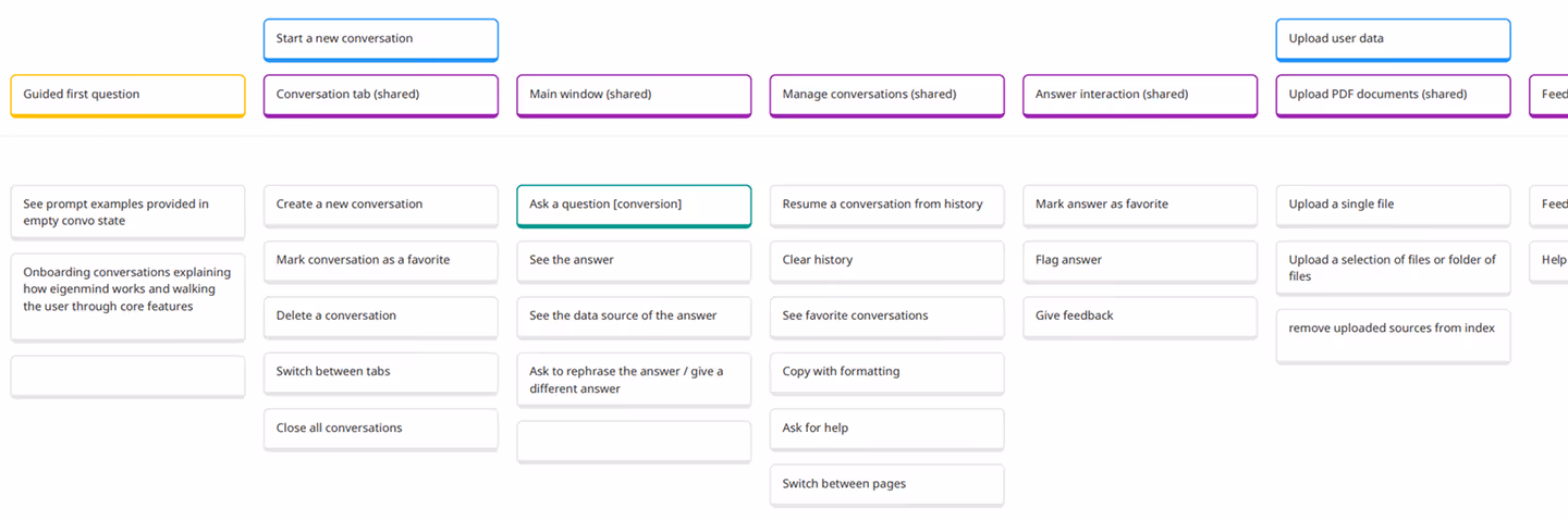
Once we had a pool of functionalities, we decided to narrow down the scope and estimate which features are must-haves, which are nice-to haves and which need more validation to even begin the estimation.
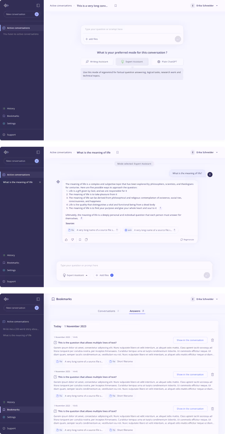
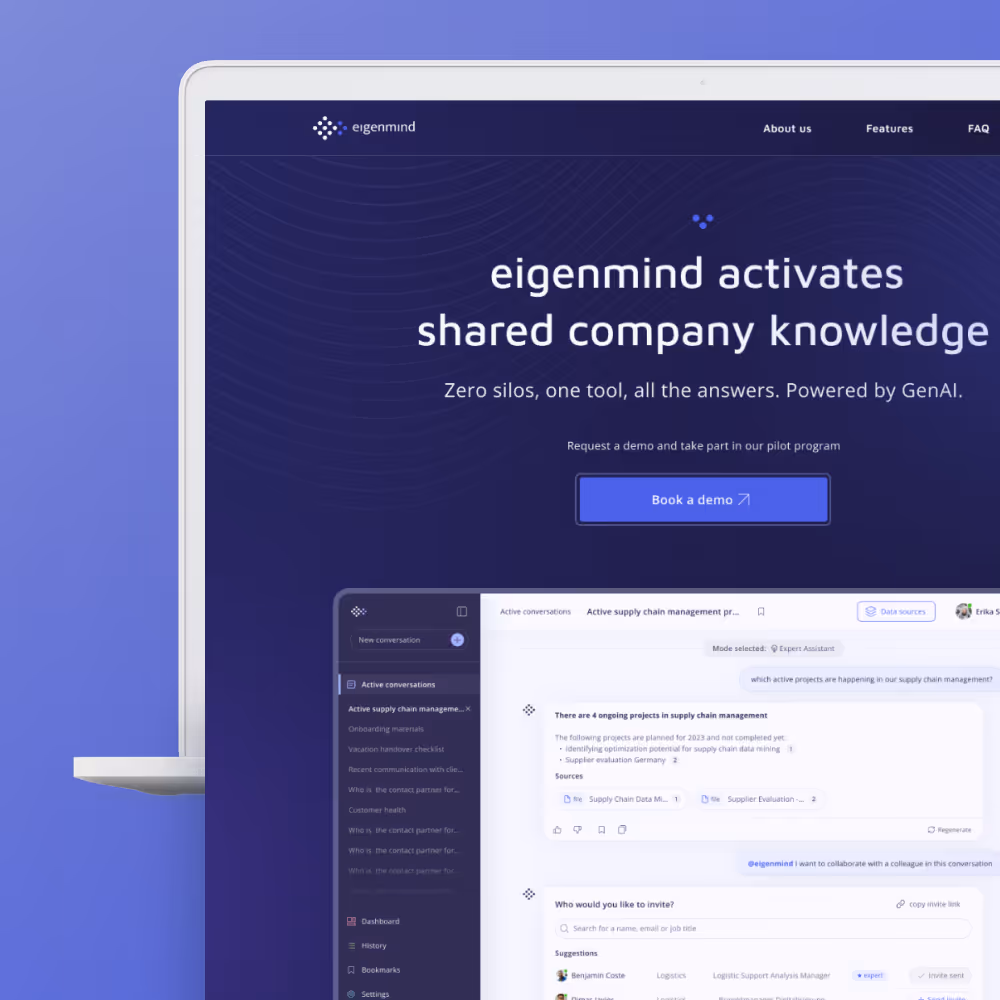
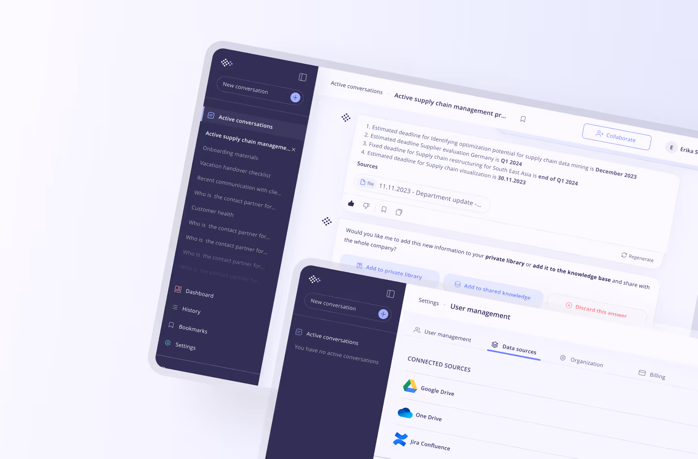
For the "regular" user we have limited the scope to core chat functions, history & favorites, collaborative chat and managing local user-specific data sources.
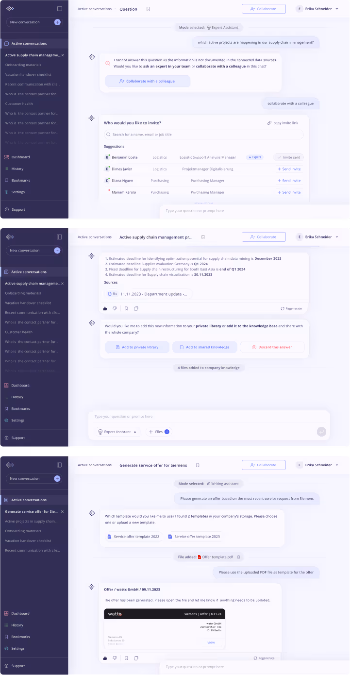
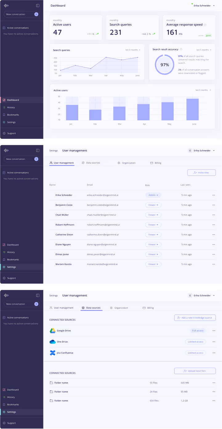
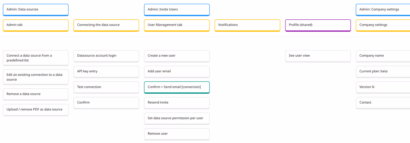
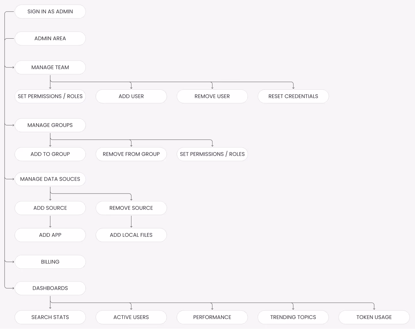
The same brainstorming process has been repeated for the admin user functionalities allowing admins to manage shared knowledge data sources and manage user access.
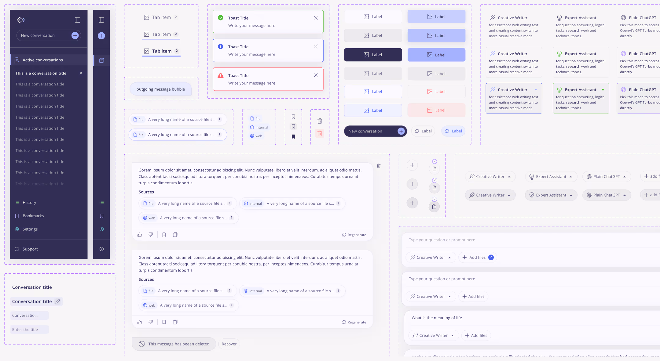
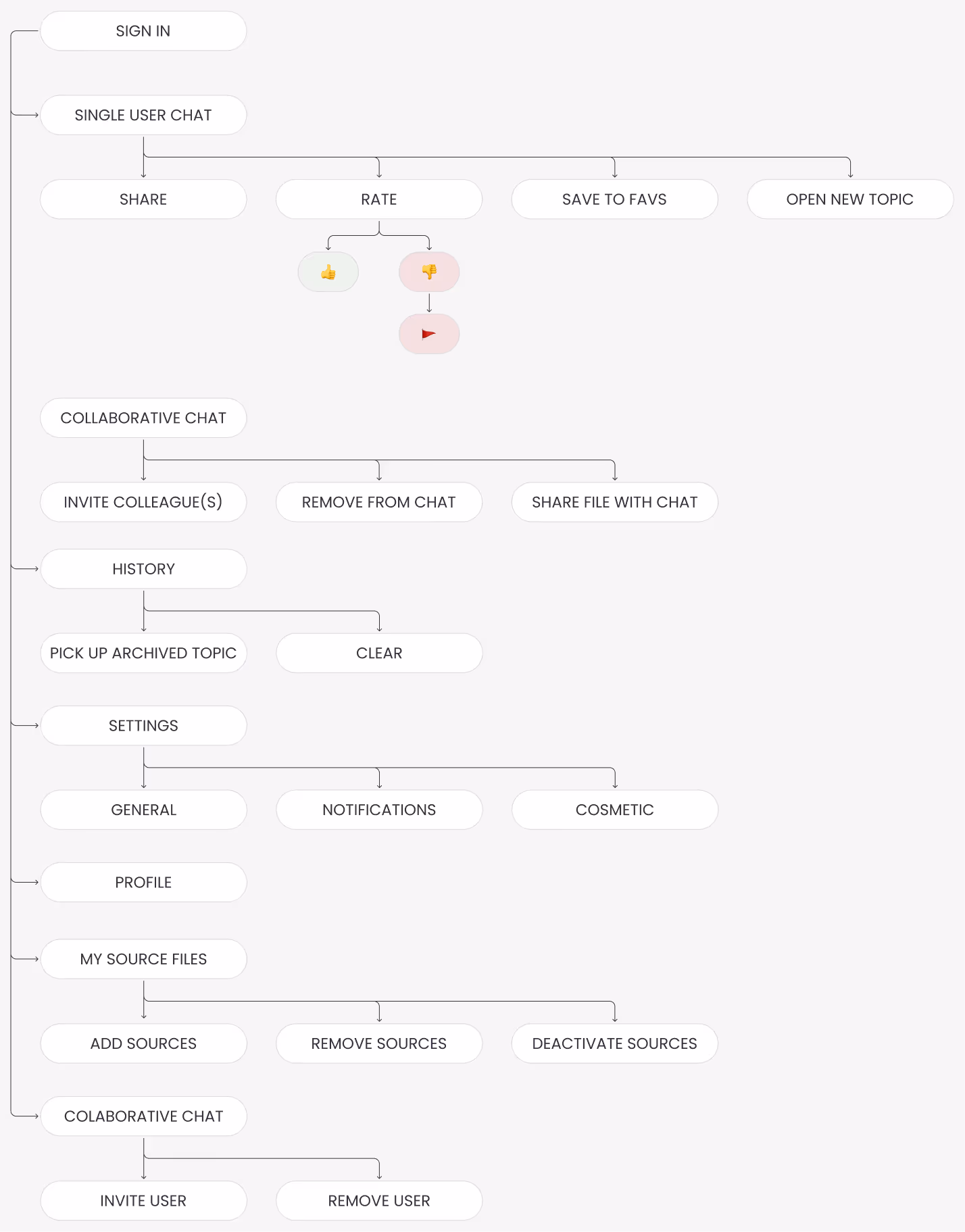
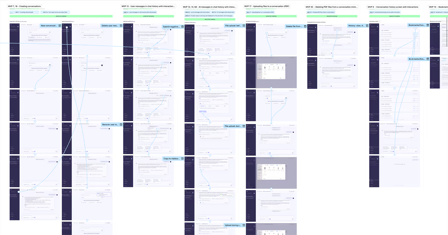
In the next step I have organized the core features in a flow chart format to visualize the logic and move onto the next step of creating first lo-fi wireframes.
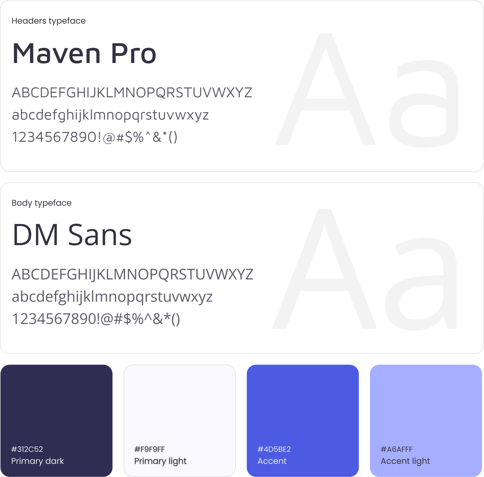
I have picked 2 font styles for header and body text and defined the core color palette with 2 base colors used for text and backgrounds taking up around 80% of the real estate and 2 accent colors for the 10-20% left.
I have organizes core, accent, and semantic color palettes with hex values and accessibility contrast ratios aligned with WCAG standards (AA/AAA).
The structured approach ensures consistency across the interface while supporting inclusive, accessible design for a wide range of users.
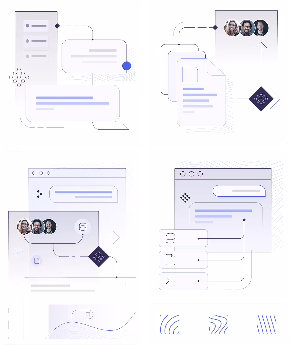
With some extra time on my hands I sketched out several modular illustrations for the landing page to add the product some personality.
After presenting the test results in the round, we carried out a workshop with the Product ownder, data scientist, developer & UI designer to ensure the implementation of the feedback is feasible and is within our timeline and budget.
I joined the project after initial scoping and early development had been completed by another designer, who had drafted the first version of the Savings feature and scheduled user interviews. After onboarding, I stepped into the interview phase to deepen my understanding of the target audience, support analysis, and familiarize myself with the product ecosystem.