Together with the team we threw some ideas into our shared Miro board to get some inspiration and to agree on the general look and feel. When working in a small team I like to involve my colleagues into the process to get out of my own head and get new ideas to think about.
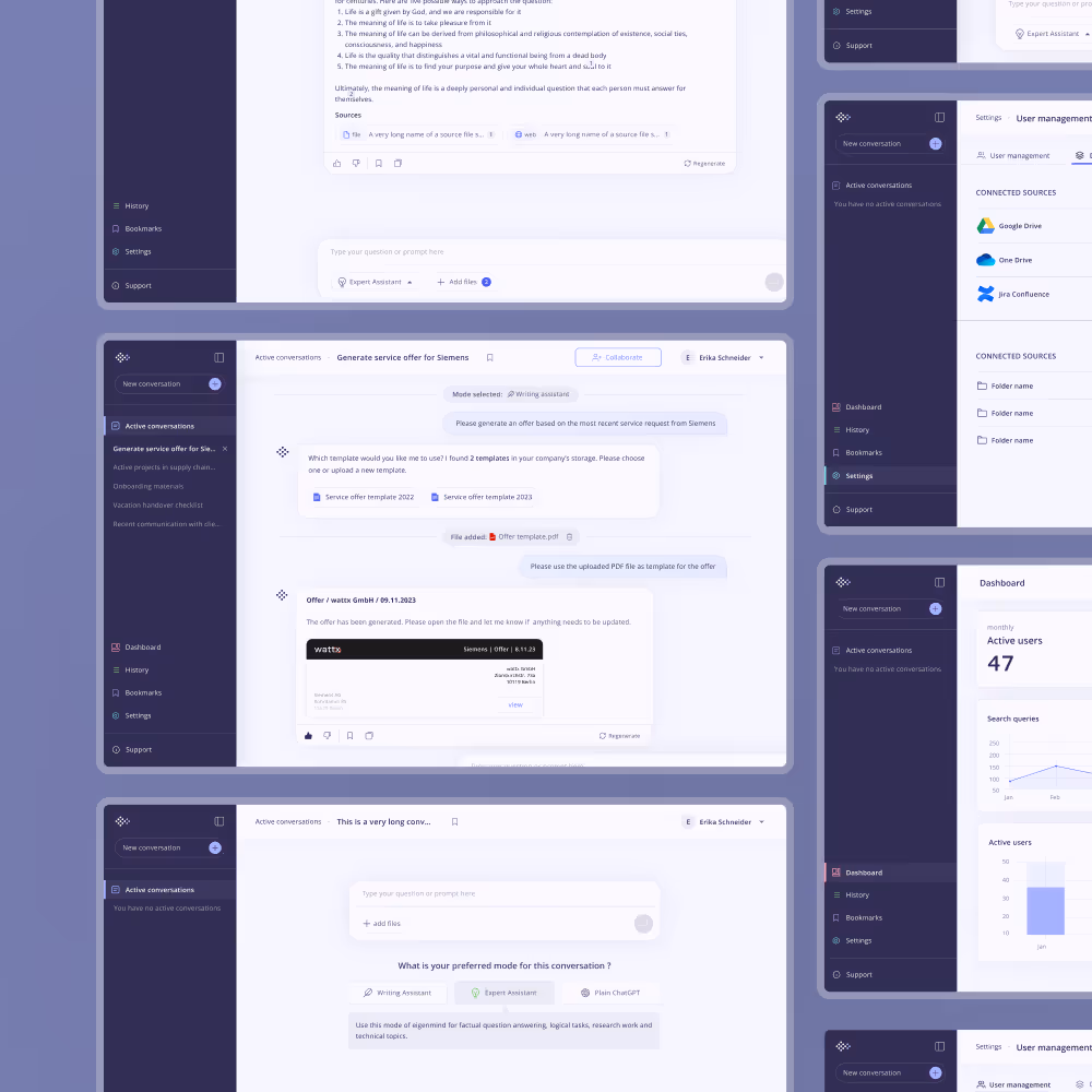
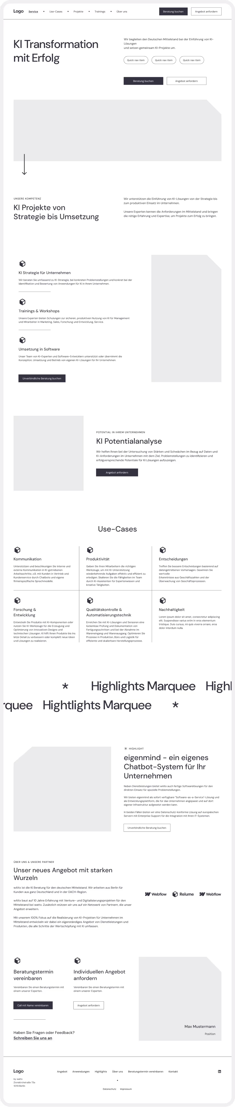
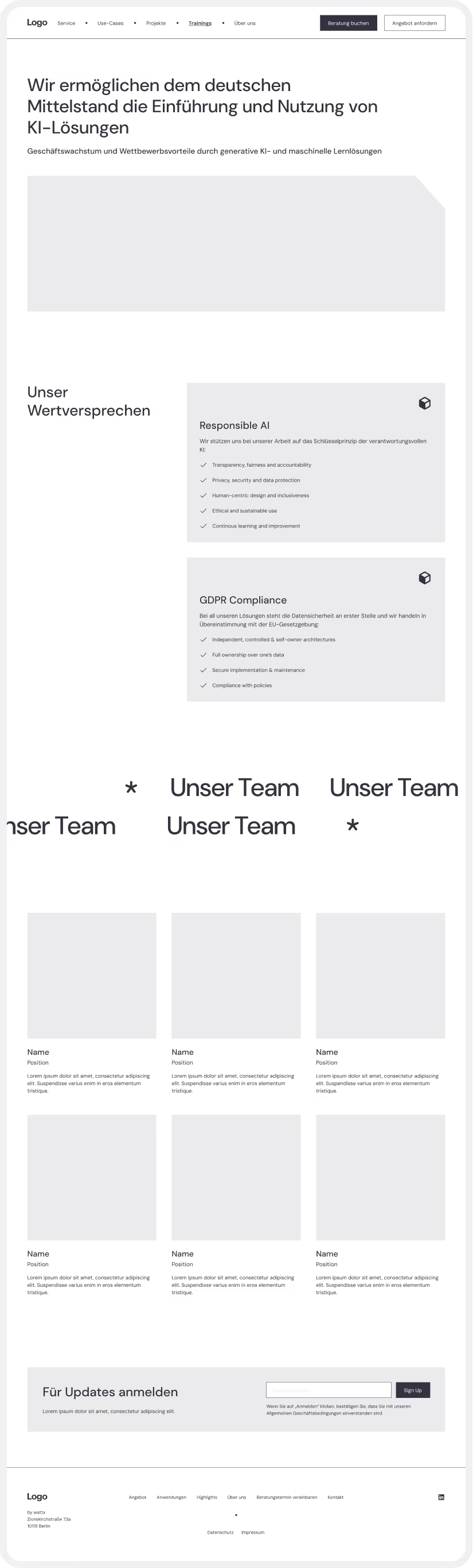
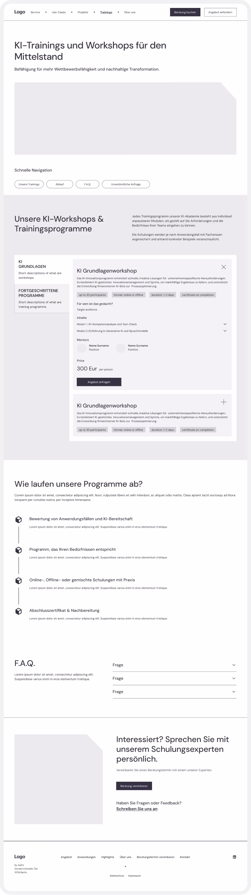
In the next step I threw together a minimalist low-fidelity version of the landing page and the "About us" page using Relume library to speed up the process and iterate on it based on the team feedback.
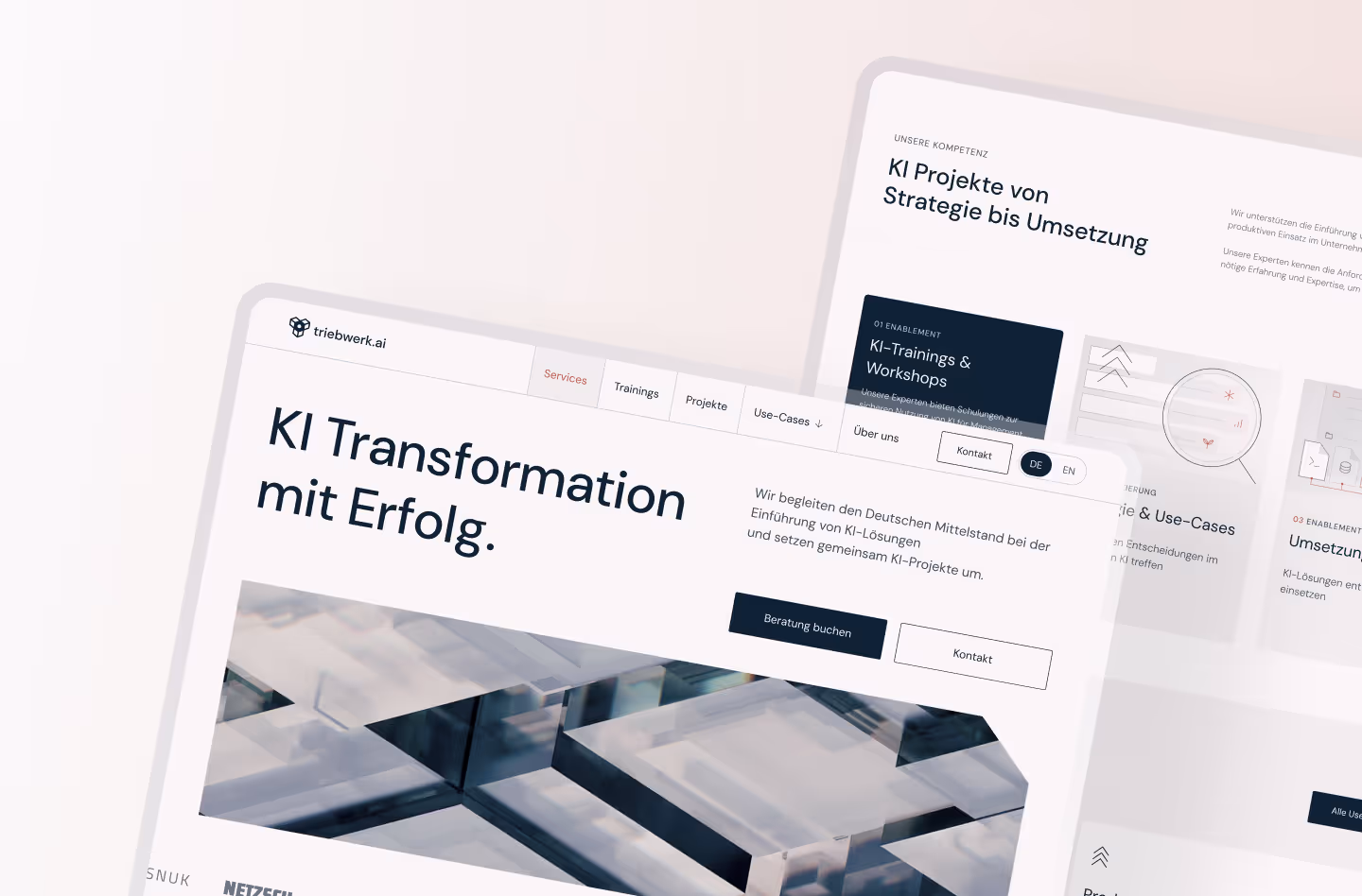
One of the core services offered were corporate trainings for AI adoption and developing custom solutions, so we wanted to zoom in and figure out the best way to showcase the offer. After getting acquainted with the competitor landscape I have drafted 3 different layout options to discuss with the team: vertical tabs, horizontal tabs and a grid view.
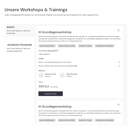
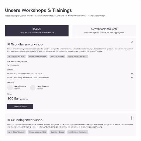
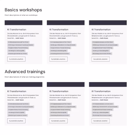
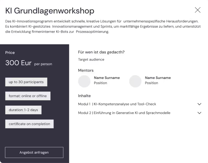
After we decided to stick with the vertical tab layout, the next question was how we want to present the training details.
Here we picked the 2 column view as opposed to a simple vertical layout as it conveniently split the information into 2 mental blocks and made it easier to percieve.
.avif)
The final low-fidelity of the trainings page included quick navigation, a tab system with training offers sorted by type: basics VS advanced programs, a block explaining the process and a contact block allowing to get in touch or request a custom training.
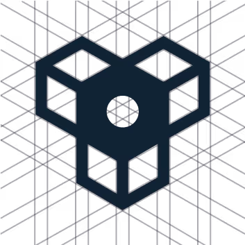
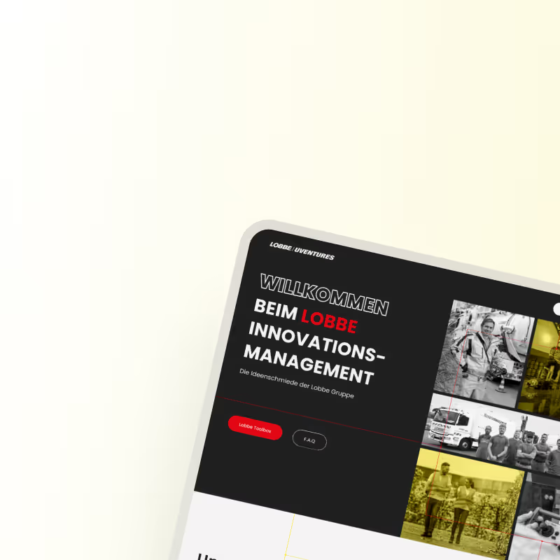
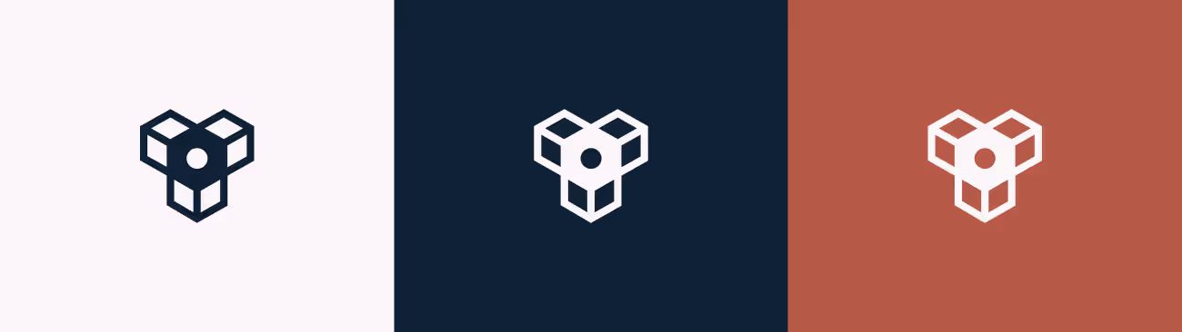
For the logo I wanted to use simple geometric shapes emulating a three-dimensional shape resembling a propeller. The dark blue color and clean lines give it a modern, technical, and precise appearance reflecting themes of engineering, structure, and innovation.
For our marketing team I made sure to prepare the documentation on how to use the logomark and logotype on various backgrounds. I exported different versions and made sure to add the visual presentation into the brand book.
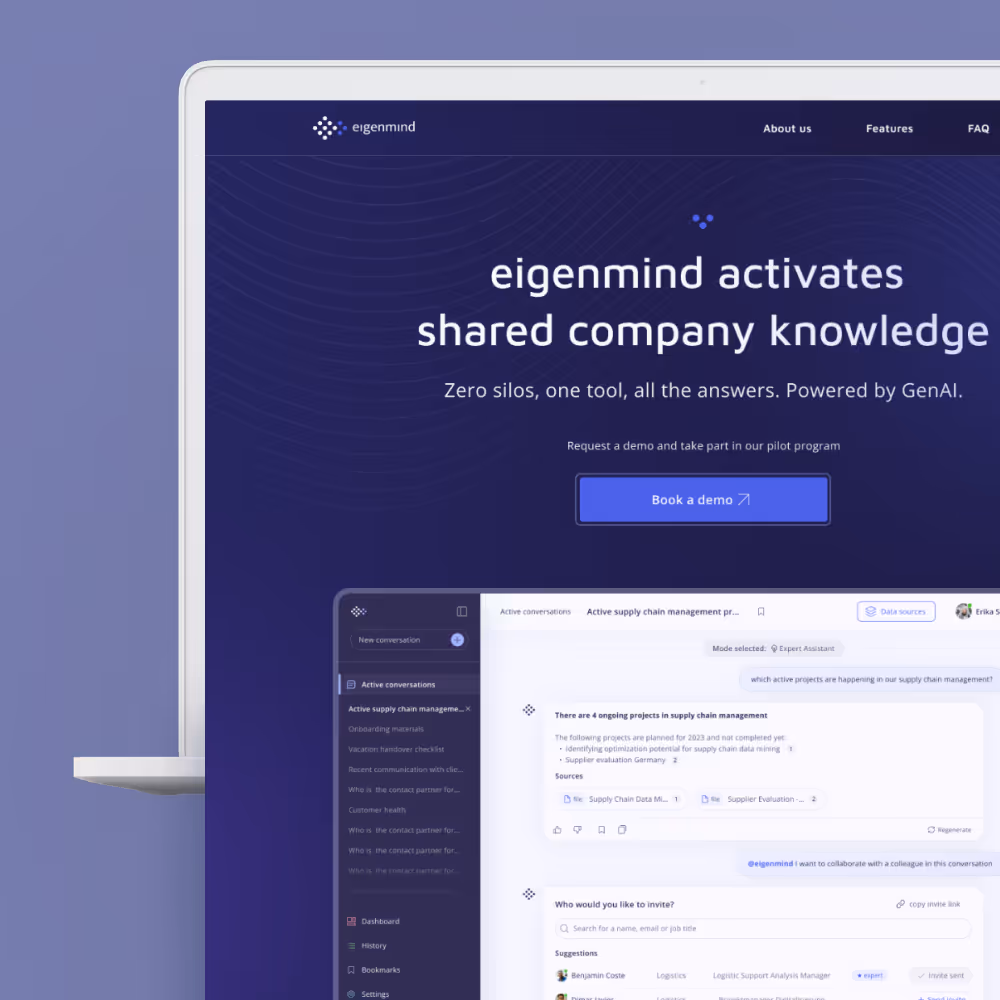
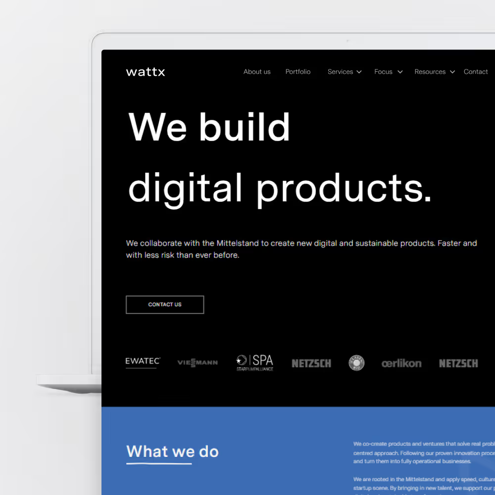
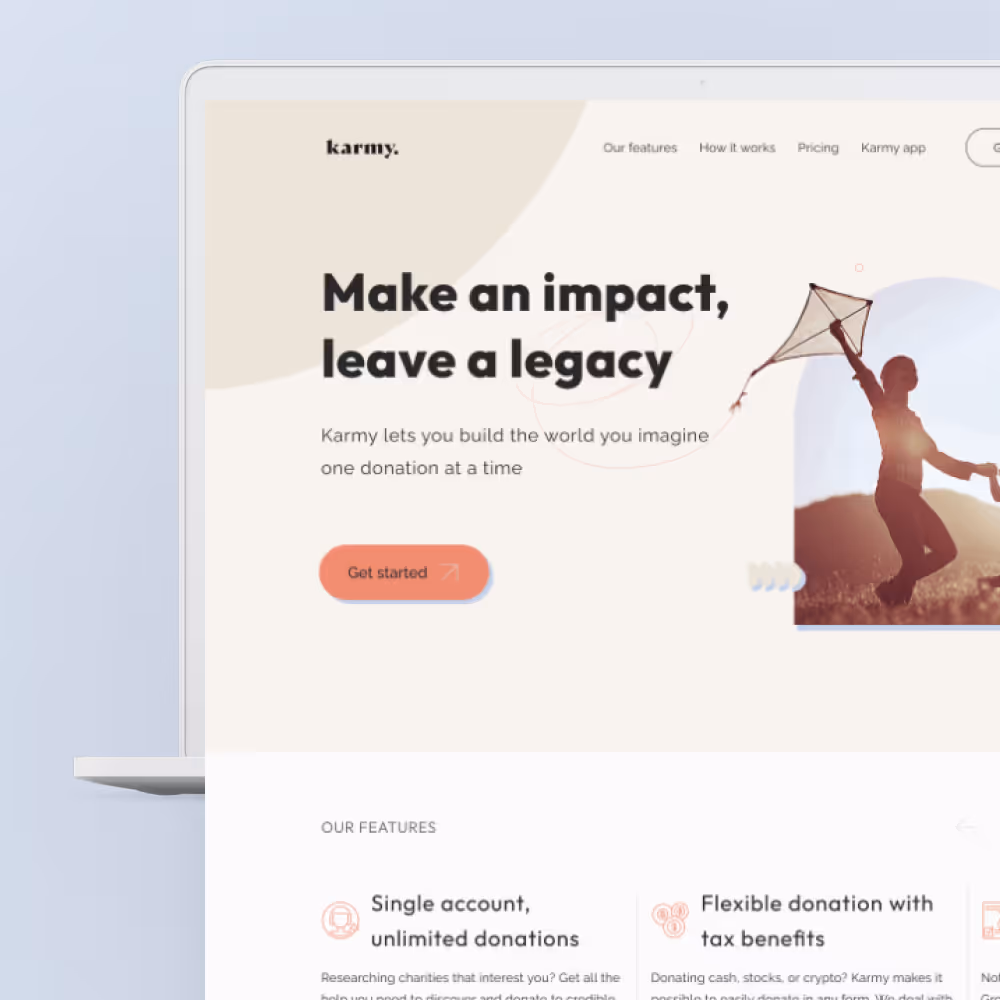
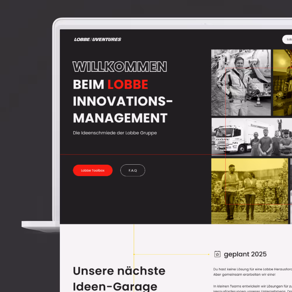
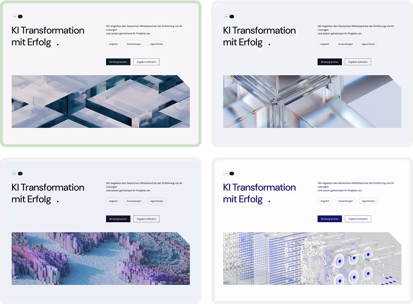
I have put together several versions with various color schemes and imagery to run by the team and most votes have been given to the version on the top left.
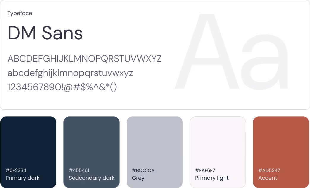
I decided to keep the font simple and stick to a single typeface for performance reasons.
Primary and secondary colors are quite reserved and muted, but we decided to give it a warm touch with a punchy accent.
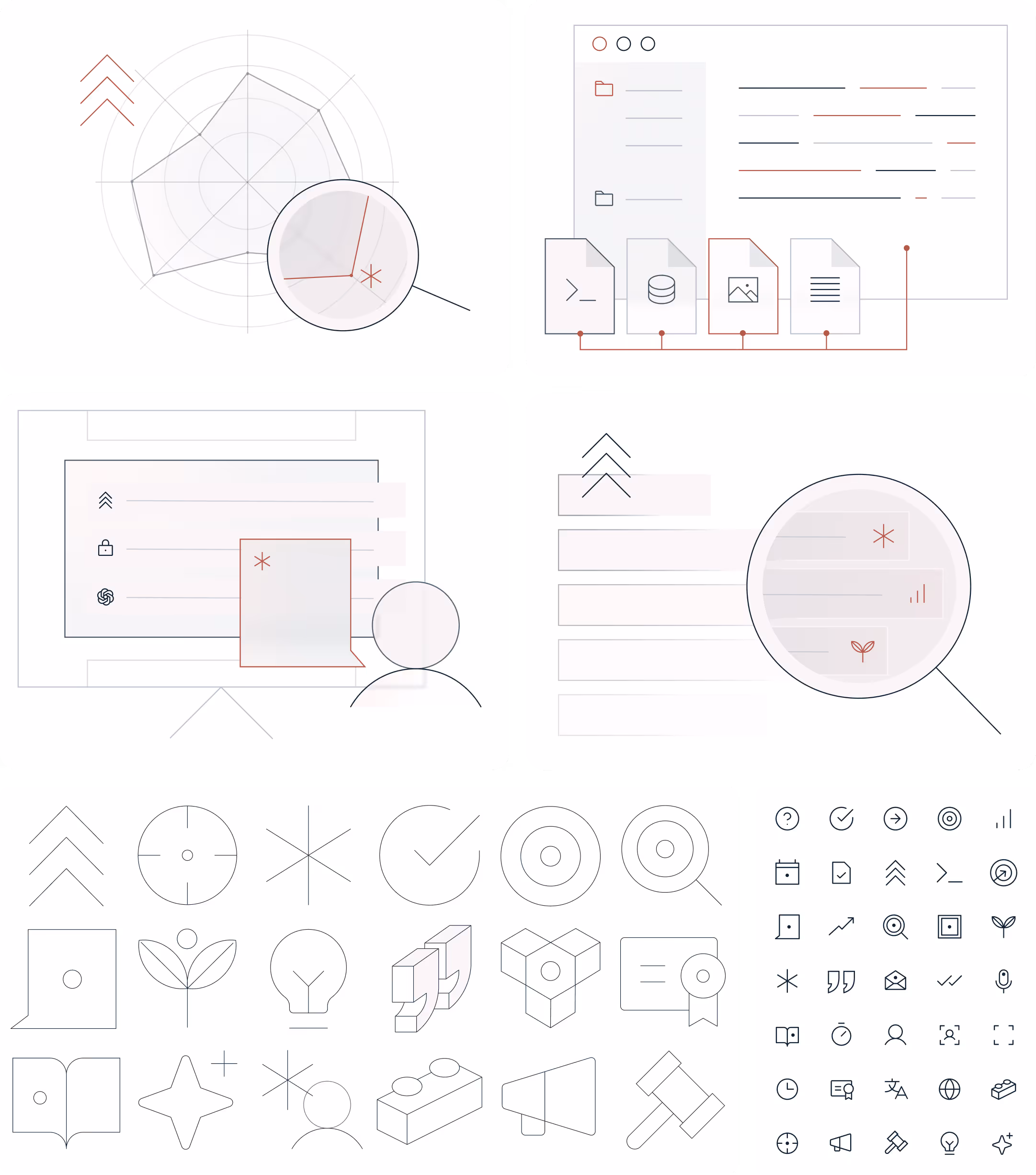
To give the site some personality and make it stand out in the competition I sketched out a couple of illustrations representing the services the company provides.
I have also created a set of icons for the website and for the presentation deck.
Once the designs have been completed in Figma I build the website in Webflow, made sure it is responsive and optimized in terms of assets. Together with the marketing team we worked on technical SEO.