We introduced the freemium model to address a few challenges. Competitors were already setting user expectations with freemium features, while many of our users didn’t even realize a subscription existed, so we needed to solve discoverability and communication issues.
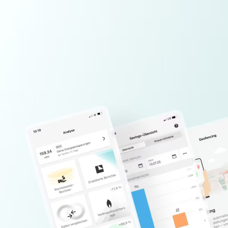
Feature descriptions alone weren’t enough to show the real value, leaving people unsure of what they’d get. We decided to explore a freemium version of the savings overview to boost awareness, make discovery easier, and see if early exposure would drive more paid conversions.
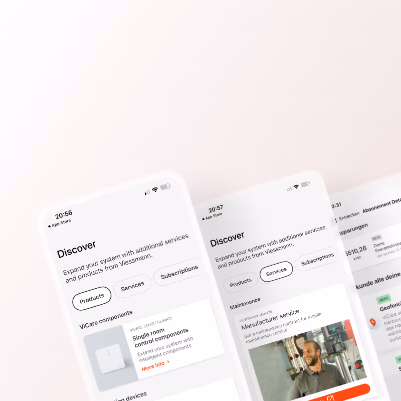
The next step was exploring ways to showcase the freemium version across the app and give users an idea through feature previews.
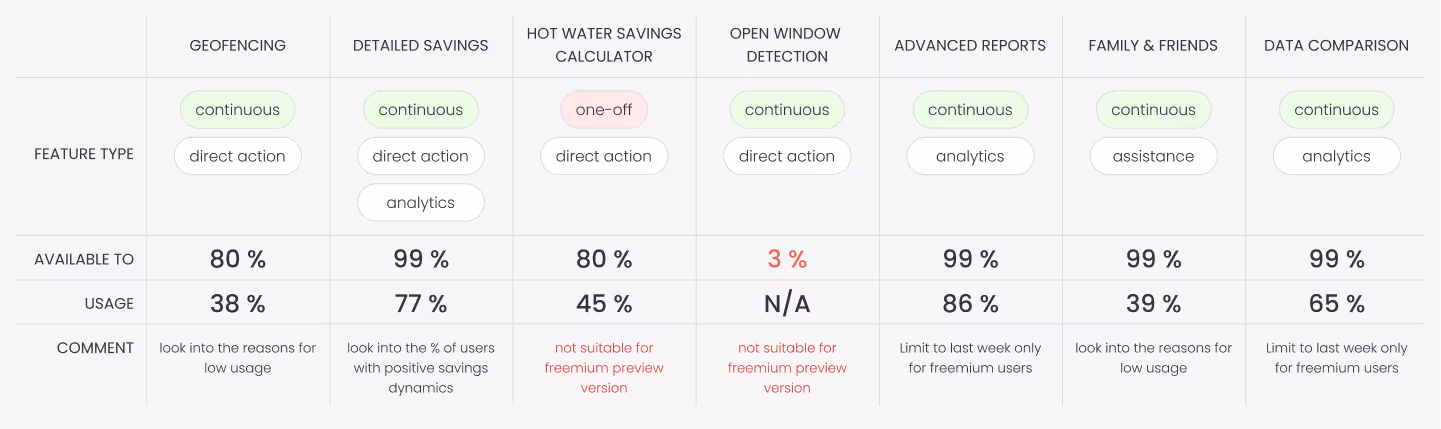
Before I started with any design tasks I decided to list all the supported features and think about which could be offered within the freemium format and which need to be behind the paywall or have a trial phase.
Here I relied on the work I did while working on the overview screens, and also looked into the feature availability to the percentage of user base. Some features were only available to around 3% of users, which made them poor candidates for freemium preview mode.
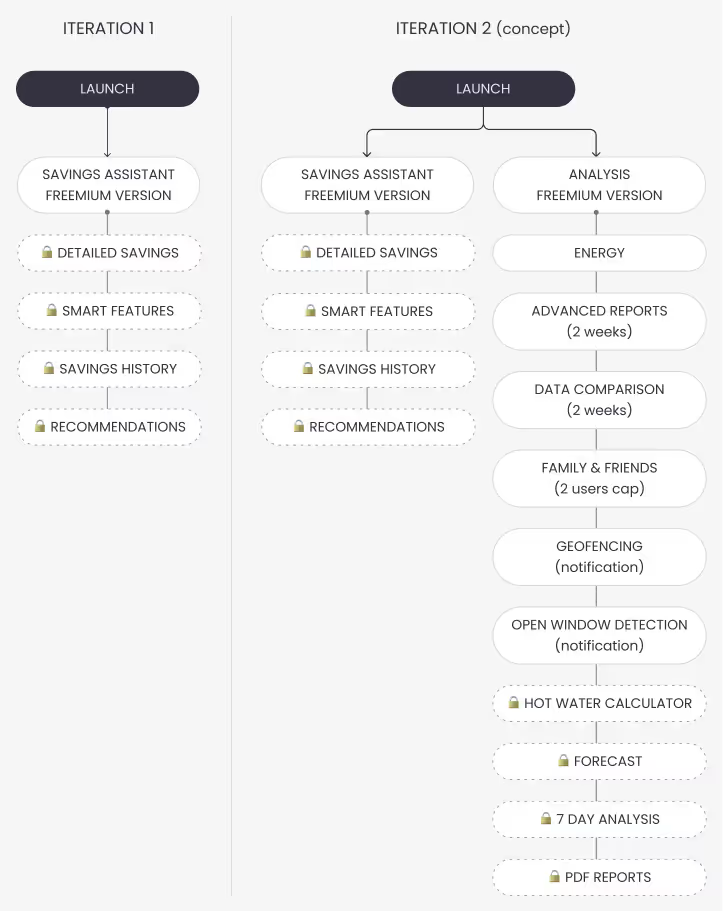
After discussing my thoughts with the team, I have created rough user flows to illustrate 1st and 2nd iterations of the feature.
This step always helps me generate kind of a site map in my head before I move on to more hands on work experimenting with low fidelity wireframes.
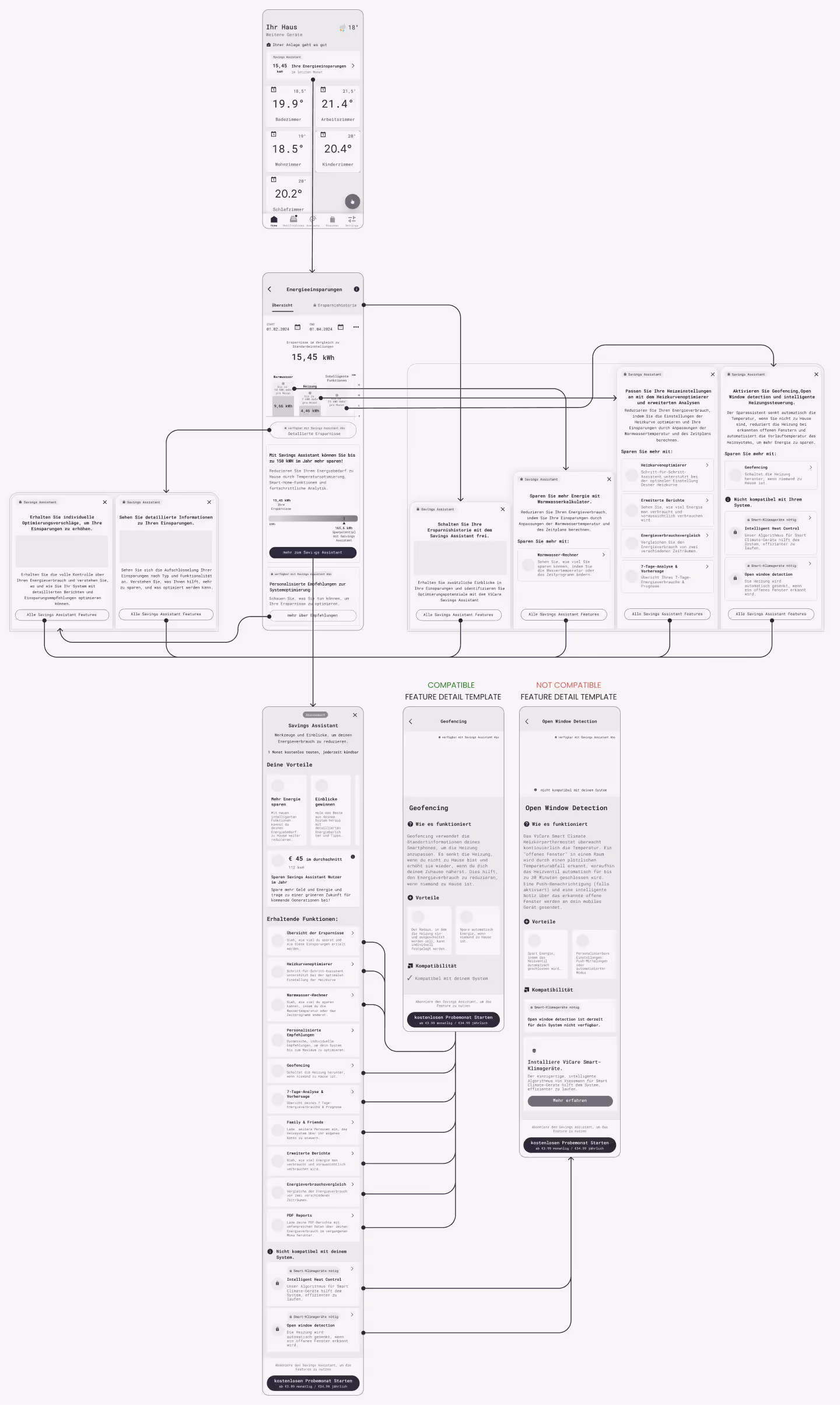
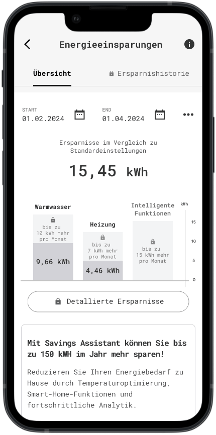
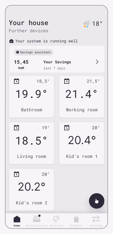
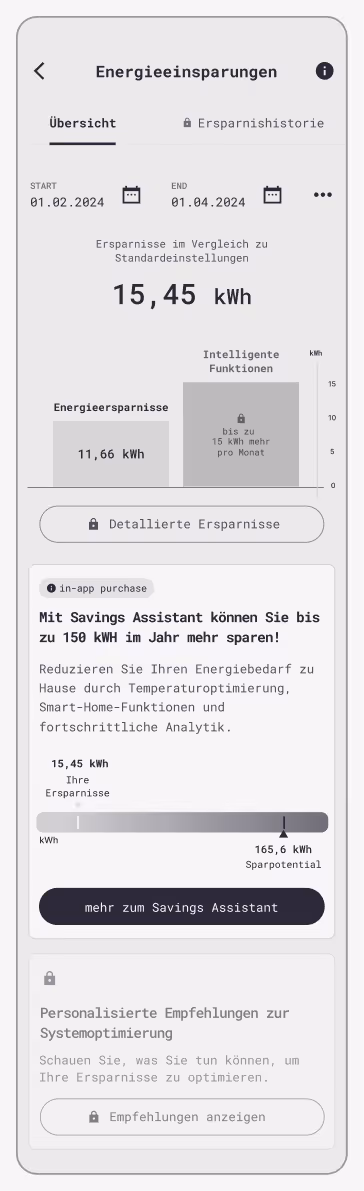
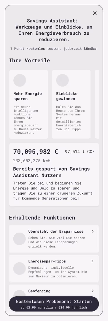
The first iteration only focuses on a single screen with a freemium version of the savings overview showing available features, value the pro version offers and pricing models.
The 2nd iteration should expand on the features available in the freemium mode also including the "Analysis" menu item.
After having a brainstorming session with the team and aligning on our approach, I sketched out some wireframes and after a couple of feedback rounds we have confirmed a version to run by real users in a qualitative interview round.
To test:
🎯 Is it understandable that savings are associated with Savings Assistant?
🎯 Is 7 days an appropriate timeframe?
🎯 Is it interesting enough for the user to investigate further?
To test:
🎯 Is it understandable which features are behind the paywall?
🎯 Is it understandable what the features do?
🎯 Are the features behind the paywall interesting to try? Are the descriptions easy to grasp?
To test:
🎯 Is the value clearly communicated?
🎯 Is it clear what the feature descriptions mean?
🎯 What are the thoughts on the "big metric" card?
🎯 Is it clear there is more information on the feature?
After we have have summarized the interviews and generated a list of issues and solutions, it was time to organize a workshop and get feedback from the team on what solution is feasible with the time, budget and tech limitations.
Issue
Users struggled to interpret the savings graph due to excessive detail and clutter.
✓ Solution
Users struggled to interpret the savings graph due to excessive detail and clutter.
Issue
Users did not immediately understand how the savings are calculated and what was the reference value.
✓ Solution
Rephrase the help text to facilitate the interpretation.
Issue
Users were reluctant to explore locked features, assuming they were completely unavailable.
✓ Solution
Redesign locked features to indicate availability within a subscription and encourage learning more.
Issue
Some users were not sure if recommendations are part of the subscriptions
✓ Solution
Make it clear that recommendations are behind the paywall
Issue
“Big metric” showing total savings across all users was seen as irrelevant and confusing.
✓ Solution
Replace with personalized estimates or user-specific data.
Issue
Some users expressed the desire to see the most impactful features at the top
✓ Solution
Order features based on perceived value
Issue
Copy was perceived as too wordy and marketing-heavy in places.
✓ Solution
Revise the copy with Product and Marketing
Issue
Trial period felt too short to evaluate value.
✓ Solution
Extend the free trial to 2–3 months; allow commitment after the trial rather than upfront.
Issue
Subscription pricing was seen as too high for uncertain benefits.
✓ Solution
Introduce a flexible or tiered pricing model based on features used or system compatibility.
⚠ Critical issue
✔ Low severity / easy fix
︖ Needs internal discussion
In this step I have gone through the screens and implemented the feedback based on test user input and internal discussions. After presenting the final result to the team I made sure to document all changes and link all relevant files in Miro and Figma as the topic was planned to be taken over by another designer after my allocated time on the project was over.
I have also had meetings with the UI designer to ensure smooth handover and to make sure all components can be translated into a high-fidelity version either with existing components or with minimal effort creating new ones. Additionally I held wrap-up meetings with the data engineer and developer to make sure there are no outstanding questions or loose ends that can emerge in my absence.
I have also mapped out next steps for the whole team according to how I’d view the development of the project and shared my concerns about possible bottlenecks.