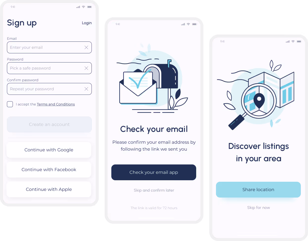
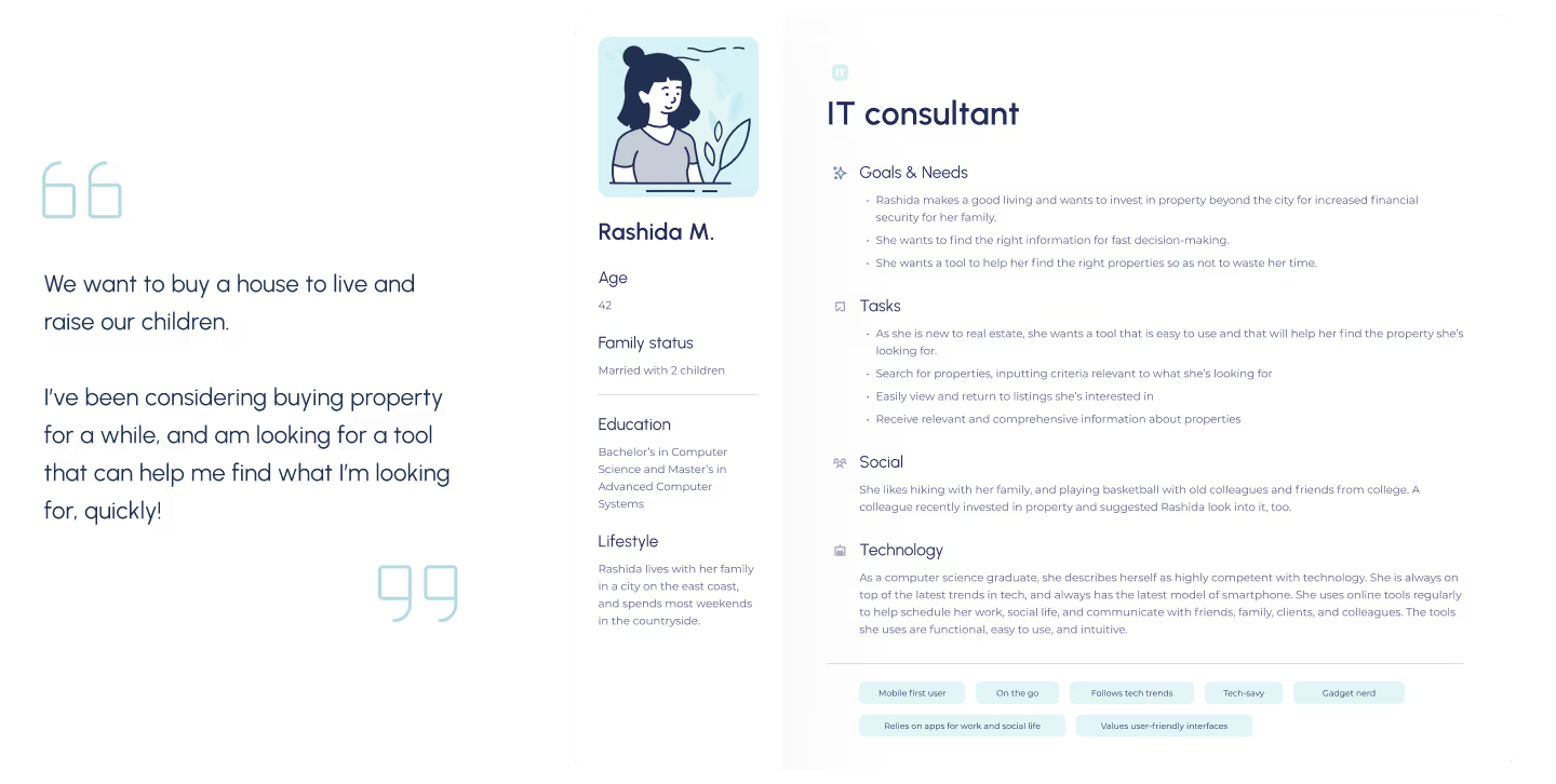
🧑 As a user, I want to create a profile containing all my property criteria, so that I am recommended results most relevant to me
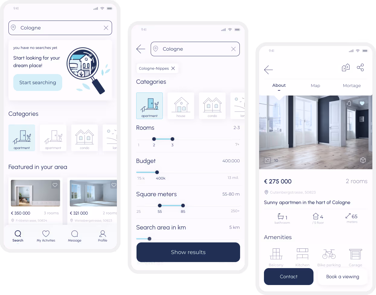
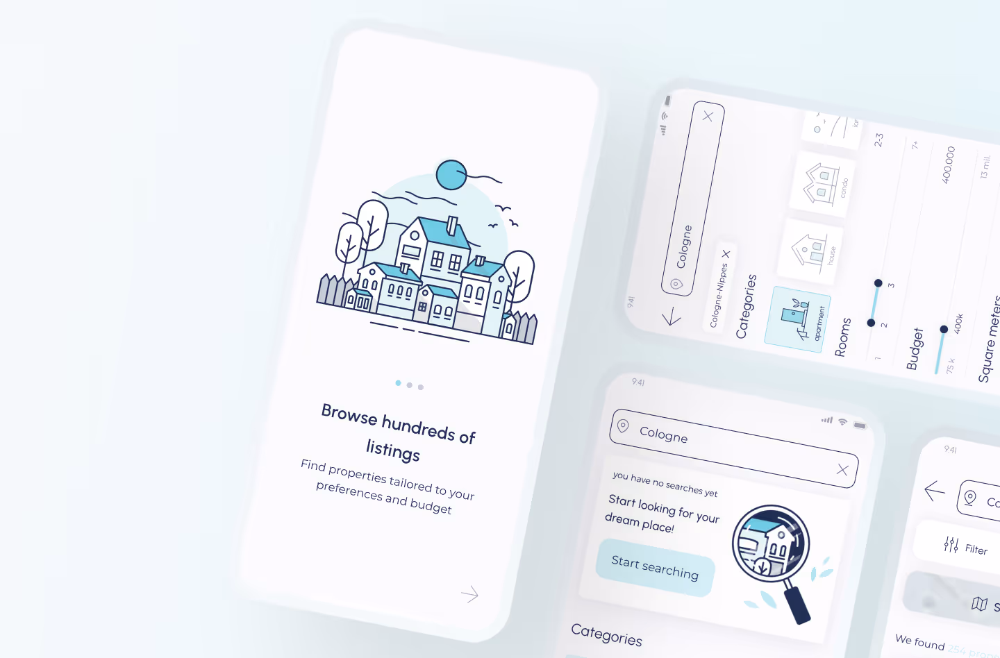
🧑 As a user, I want to be able to search and filter properties, so that I can find good matches based on my needs
🧑As a user, I want to be able to save or mark properties I am interested in, so that I can easily revisit them
🧑 As a user, I want access to as much written and visual information as possible about properties I’m interested in, so that I can make an informed decision
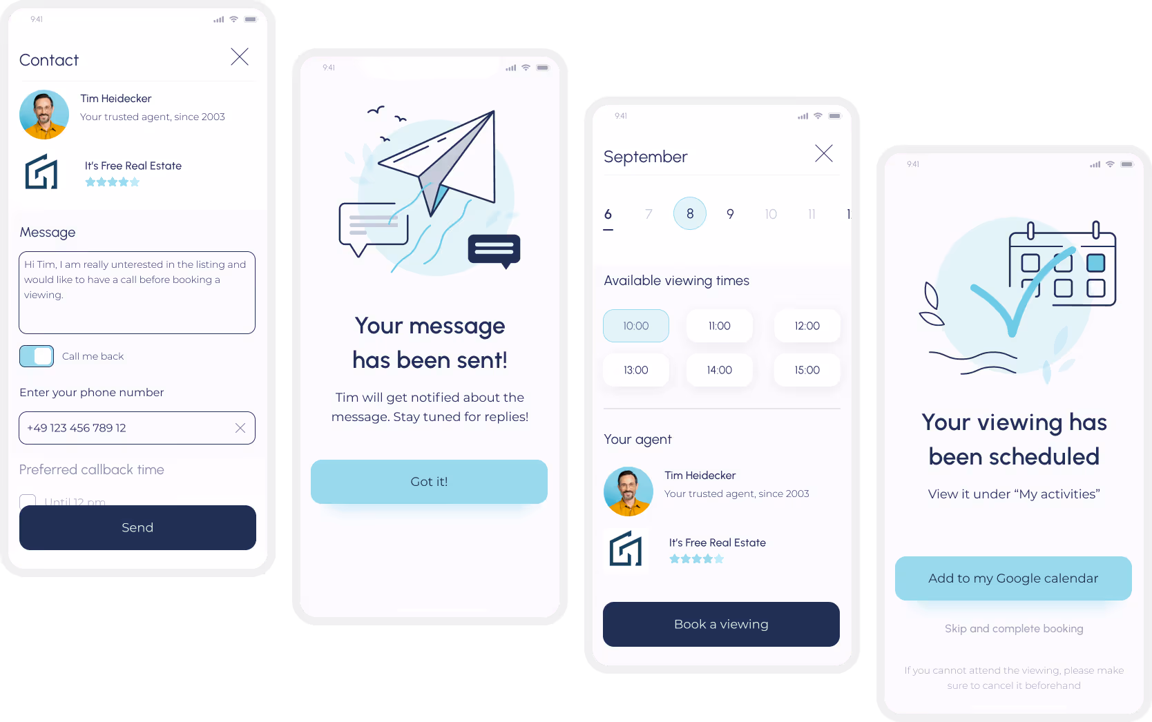
🧑As a user, I want to be able to contact the right people if I am interested in viewing a property, so that I schedule a viewing
🧑 As a user, I want to see how well a property meets my criteria or compares to other properties, so that I can refine my options.
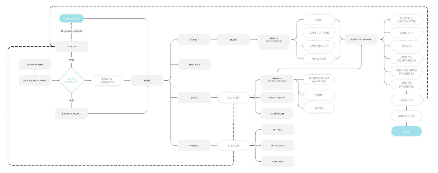
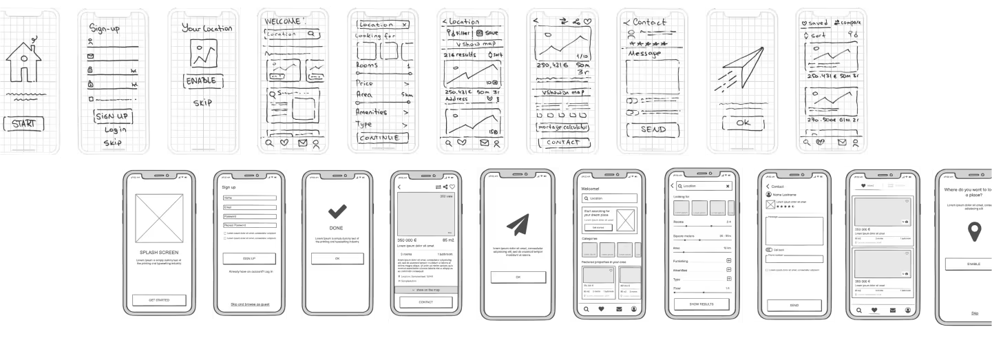
After I have defined the core structure of the system, I started experimenting with the native app layout. After I was happy with the navigation and overall positioning of UI elements, I have reproduced this design in a higher resolution using Balsamiq.
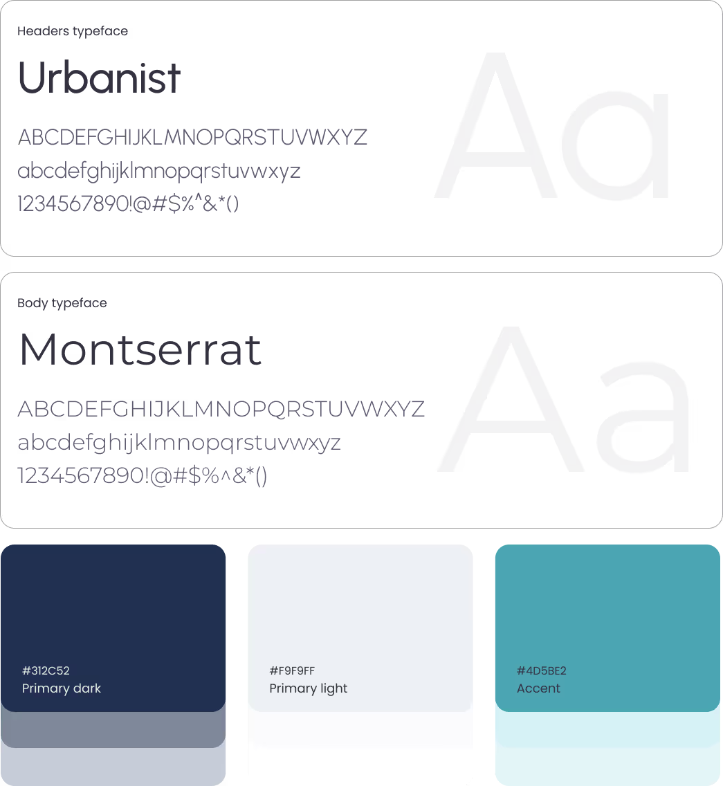
In this step of my design process I have fine-tuned my mockups in Figma. I've defined the grid I want to be using for the mobile app (modular 6 col grid with a 16 px margin, 16 px gutter coupled with a baseline 8 px row grid). I've also defined vertical and horizontal spacing and started experimenting with the typefaces.
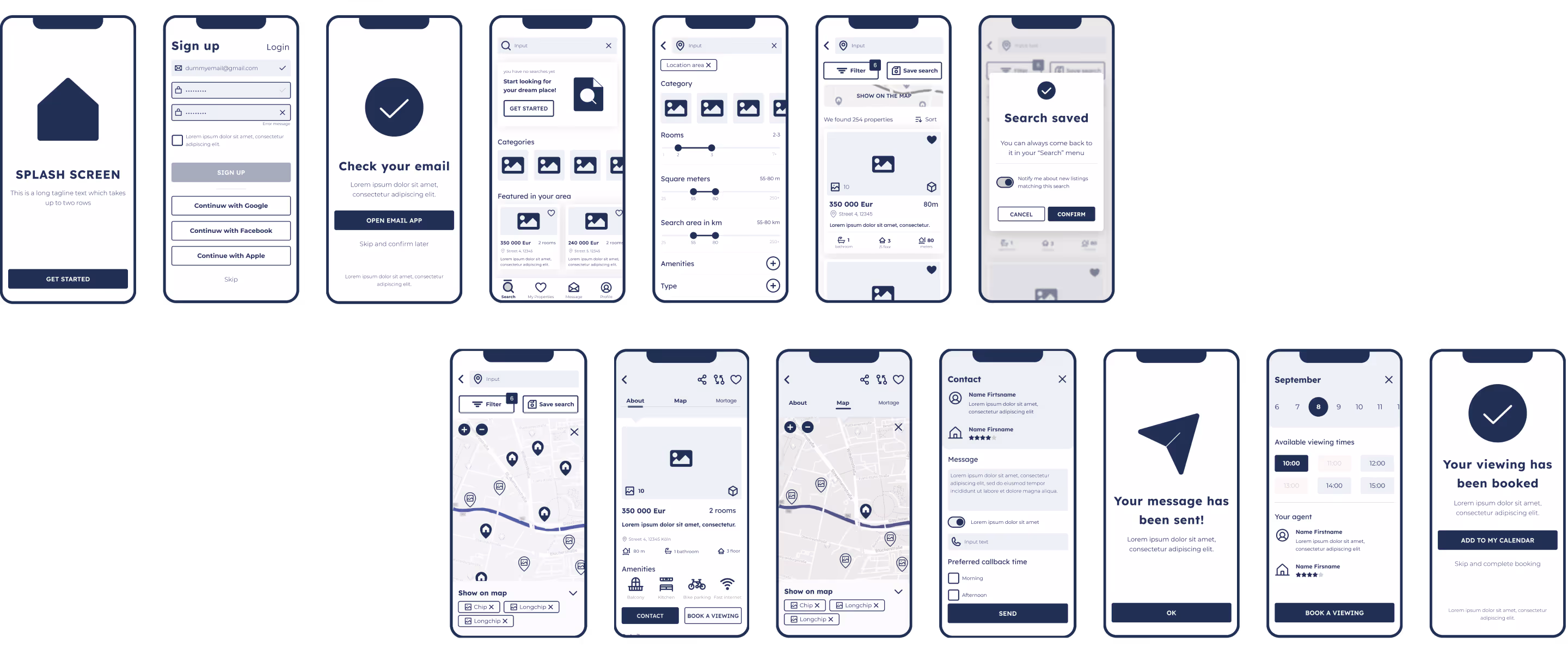
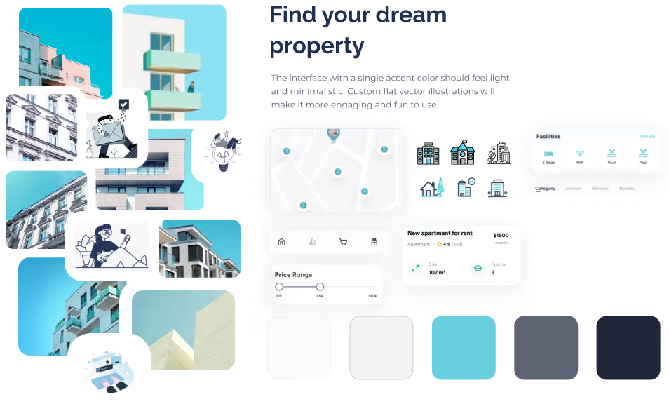
After carrying out a competition analysis and getting acquainted with various trends, I've picked 2 color schemes. In the end I have decided to go with a cyan-grey color palette with a single accent color inspired by urban architecture, blue sky, glass and concrete.
I wanted to use shadows to elevate elements and create some contrast and use minimalist icons and tabs. Custom icons and illustrations helped tie the interface together and make it feel professional
Although I wanted the interface to be minimalist and clean, I thought it could use some fun elements.
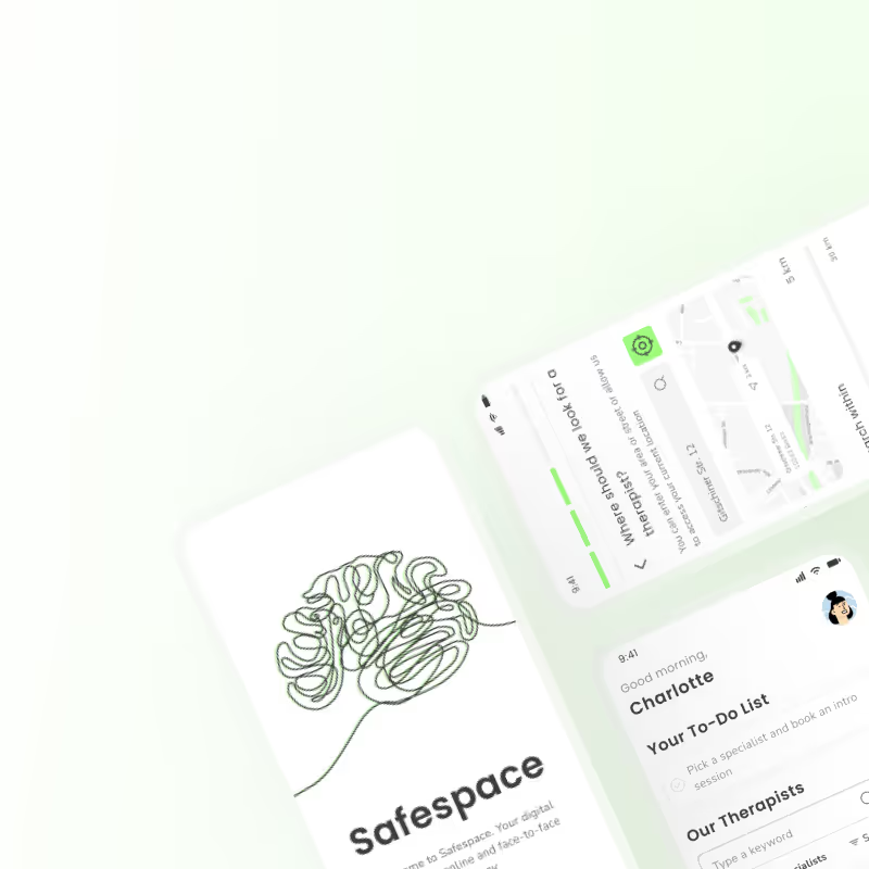
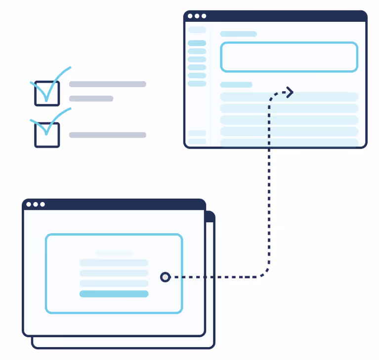
To give the interface a personal touch, I've designed several custom illustrations.My main goal was to make the app more "human" but not overload it with imagery in a distracting way.
.avif)

I still had some time with this project and I wanted to learn Principle and craft a splash screen and onboarding animation for this app.
I joined the project after initial scoping and early development had been completed by another designer, who had drafted the first version of the Savings feature and scheduled user interviews. After onboarding, I stepped into the interview phase to deepen my understanding of the target audience, support analysis, and familiarize myself with the product ecosystem.