I started with getting to know the landscape when it comes to online therapy services and took a look at the competition, specifically BetterHelp, Talkspace and 7Cups. Each of these platforms has its strengths and weaknesses, and this helped me identify opportunities for Safespace to use.
I ran an explorative survey to get a feeling for the sentiment around online therapy.
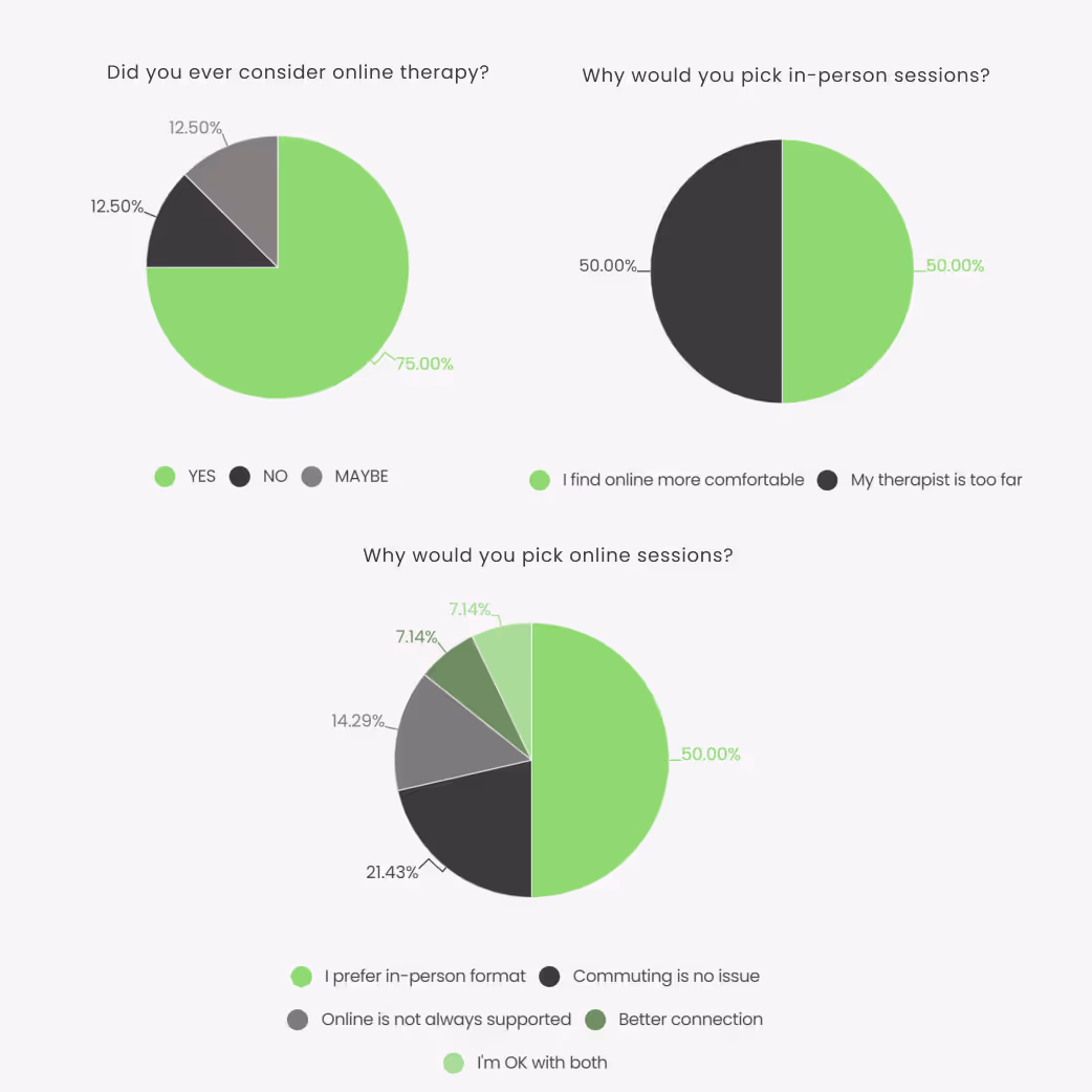
8 out of 14 respondents never sought professional psychological help, though half of them had considered it.
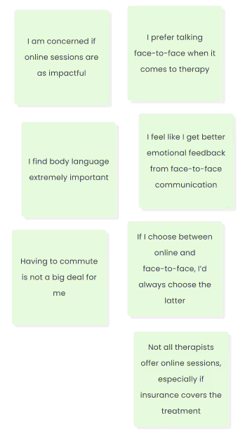
All but one received therapy in person. Of the 8 who answered about online counseling, only one (7%) said they would never consider it.
Main concerns were reduced personal connection and difficulty interpreting body language.
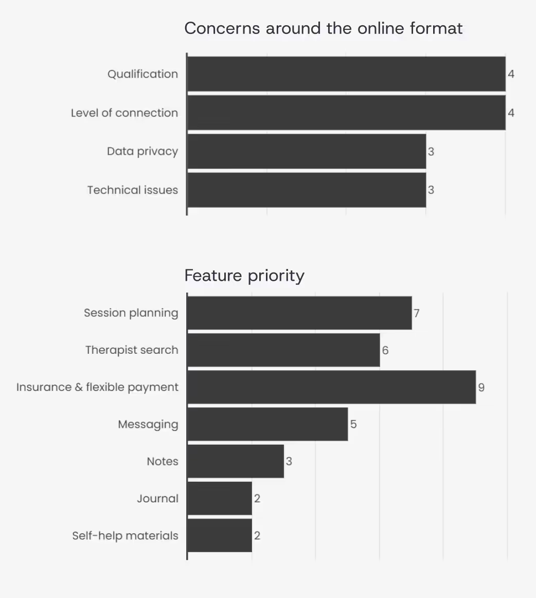
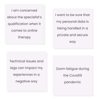
The main concerns are addressing specialists' qualifications, data privacy, and possible technical issues disrupting the session.
Doubts around being able to build a connection and trust with the specialist in online format has also been mentioned by 3 out of these 6 respondents.
This makes it the second most prominent issue addressed in the survey.
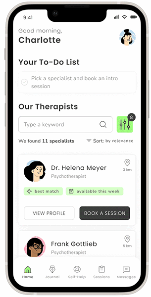
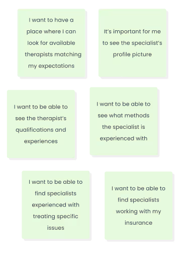
The most demanded feature would be access to insurance coverage and flexible payment model. This confirms the assumption that insurance application is a painpoint for potential users and should be addressed in the service.Being able to find the right therapist, plan sessions and be able to reach out to them is another core functionality expected from the app.
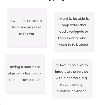
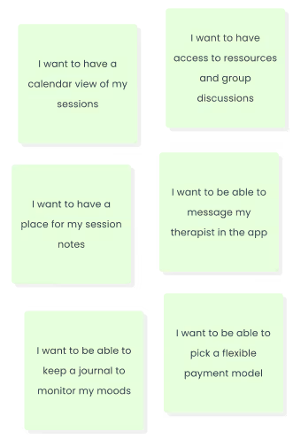
The survey data has been used as an entry point to shape a script for the user interviews and identify areas that need more investigation. I’ve carried out interviews with 3 participants to identify main needs, goals and frustration one may have when looking for a therapist and going through the treatment. When all data has been collected, processed and sorted, I’ve organized the insights by topic to have a better overview over core sentiments.
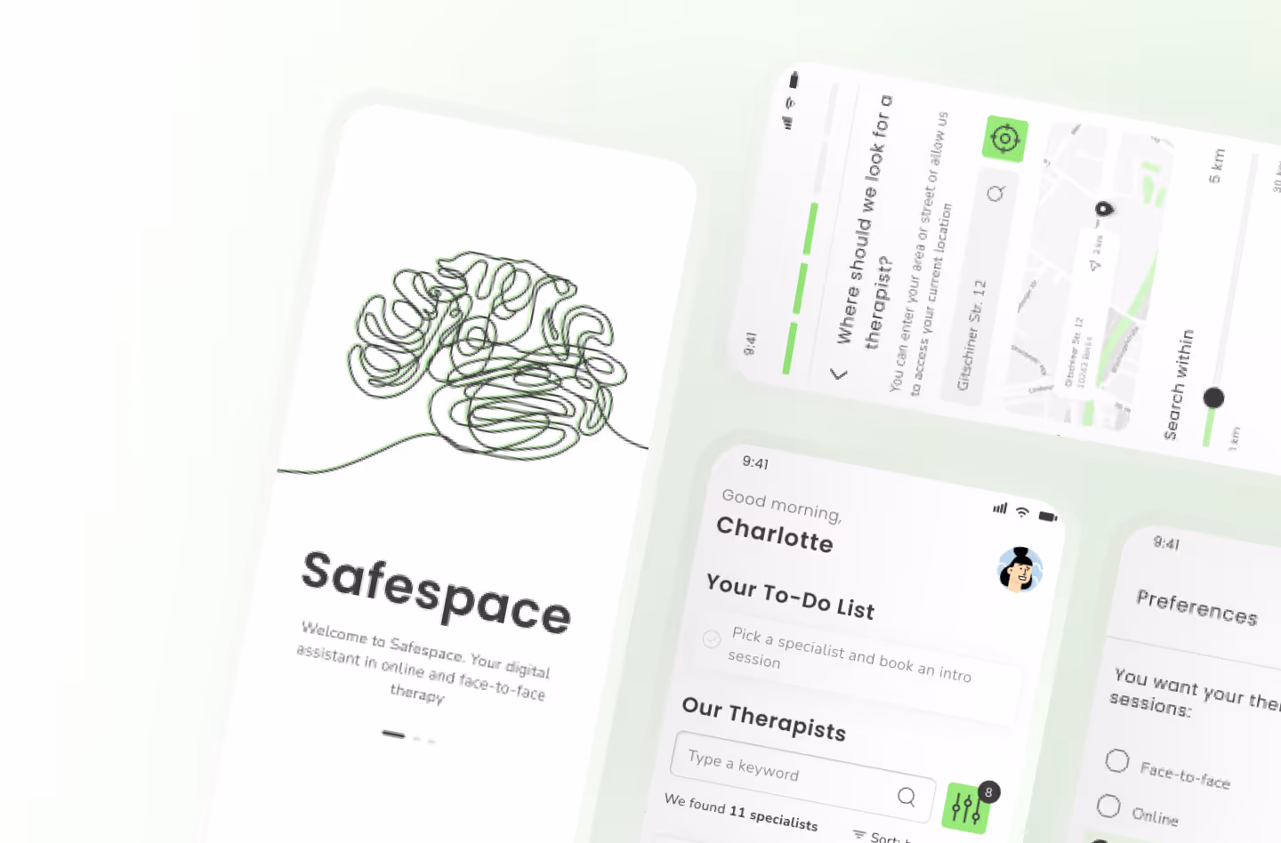
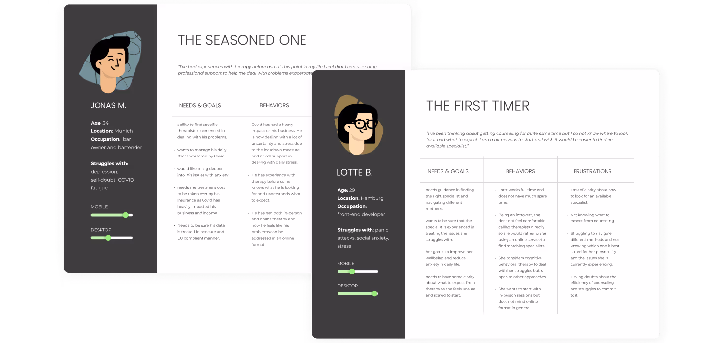
The collected information gave me a good understanding of the problems people run in when looking for therapy options and what concerns they have. Based on the information I’ve created 2 personas and outlined the scope of the services the product is going to provide.The app focuses on adults (18 y.o and older) seeking professional psychological guidance in challenging life situations or/and struggling with specific psychological issues, such as such as stress, anxiety, depression (not in acute state), eating & sleeping problems, trauma, anger issues, family conflicts, LGBT matters and grief.
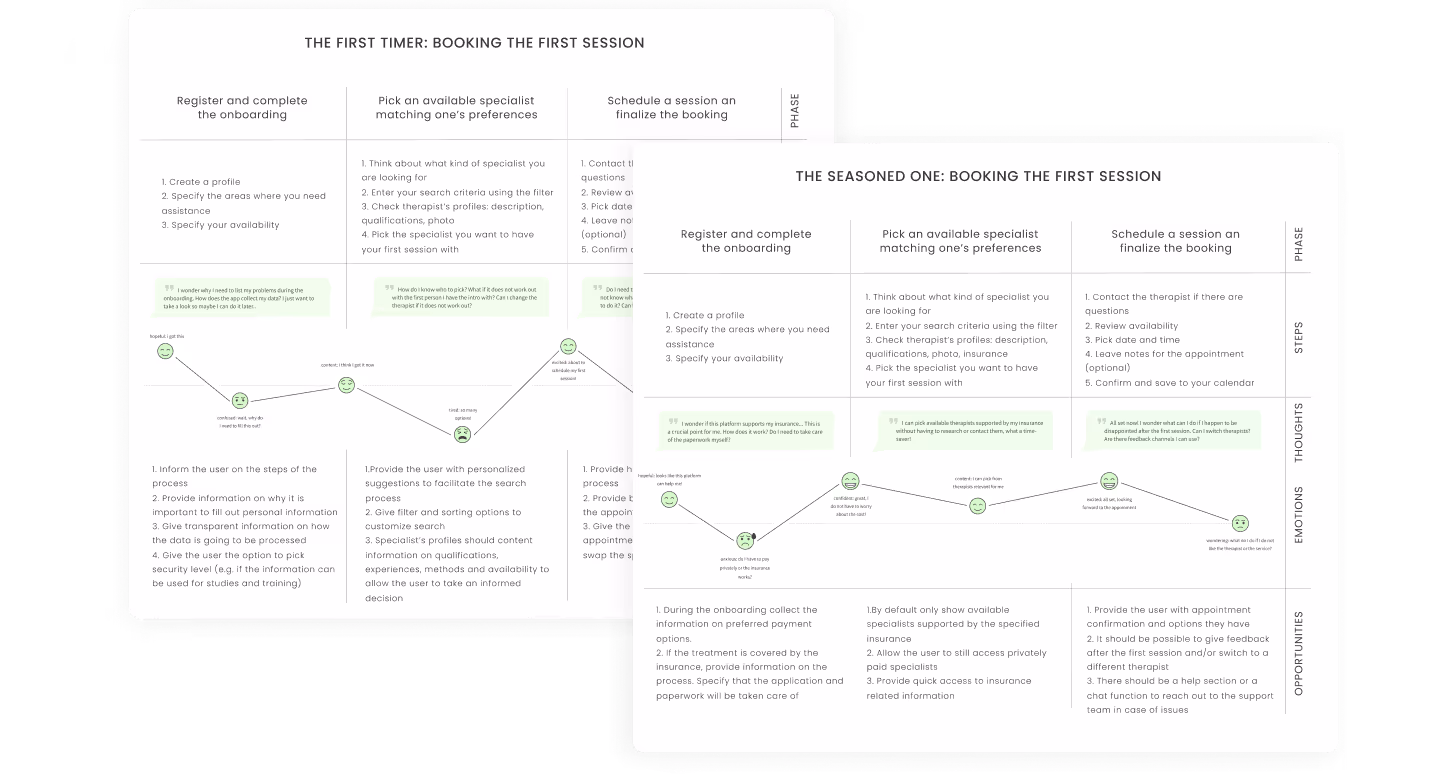
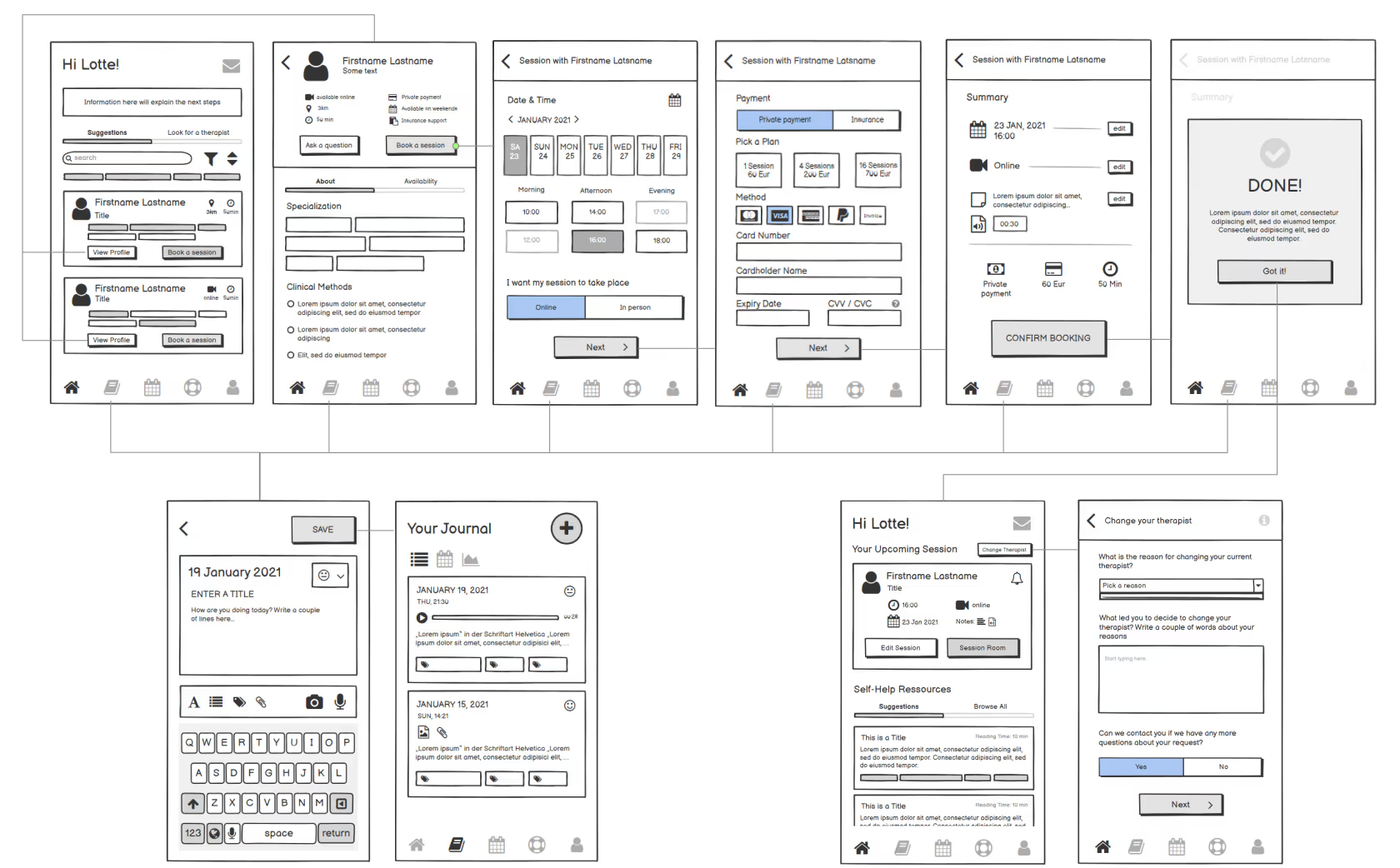
Based on the insights collected during the interview, I have sketched out the user journeys and illustrated the session booking process for the 2 core personas defined in the previous steps.
At this point I have focused on the steps of the process and the experience the user might have when going through the steps. Understanding the thoughts and emotions can help identify improvement opportunities to make the process smooth, intuitive and stress free.
The collected information gave me a good understanding of the problems people run in when looking for therapy options and what concerns they have. Based on the information I’ve created 2 personas and outlined the scope of the services the product is going to provide.
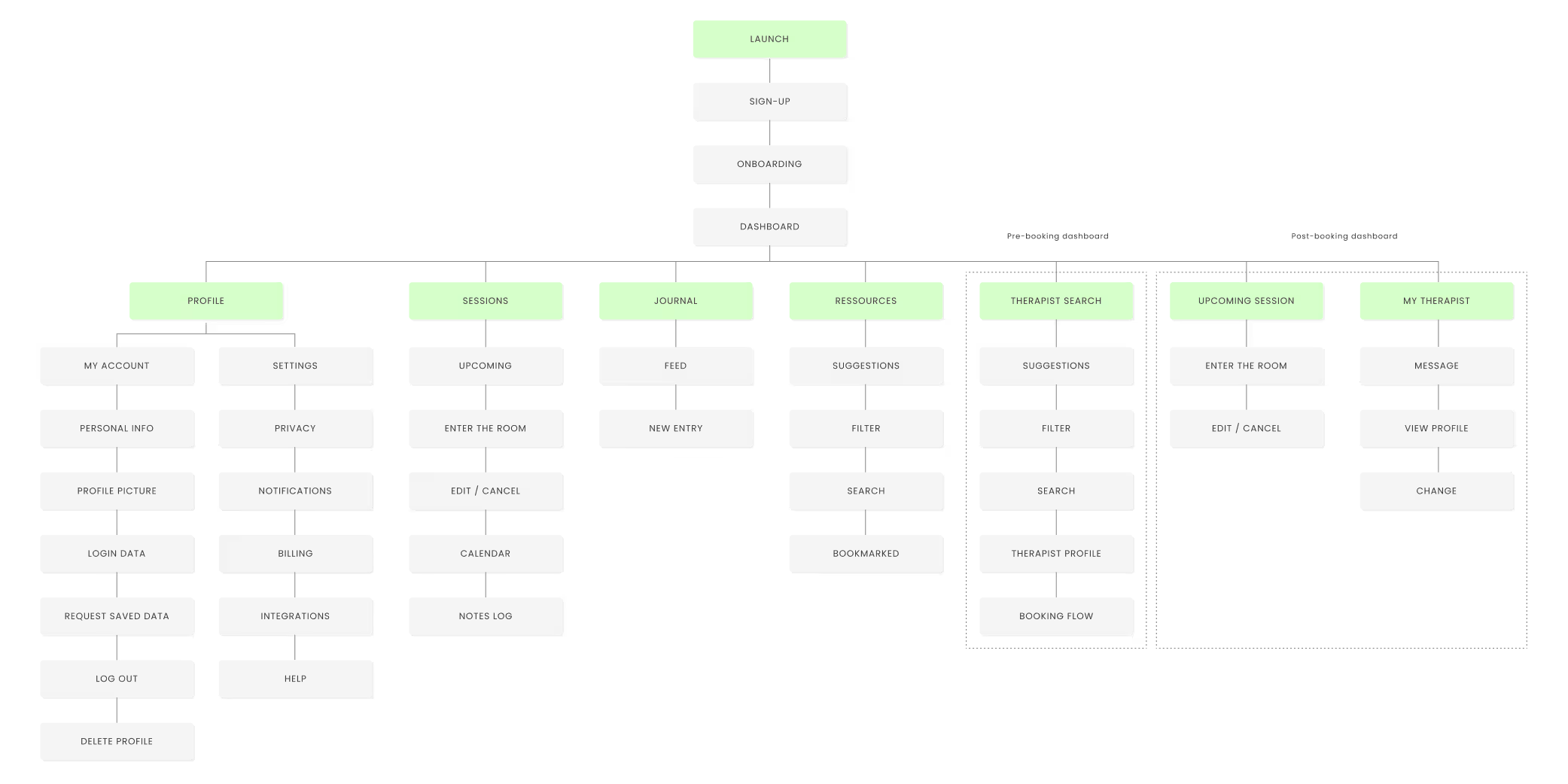
I’ve performed a card sorting test and polished the sitemap according to the results, but I did not observe any big surprises in terms of system structure and information architecture when reviewing the results.
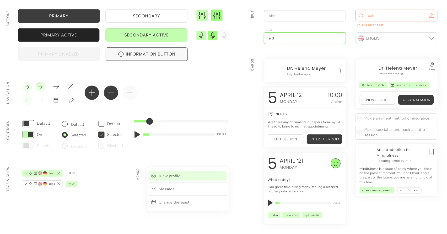
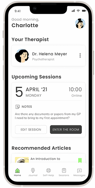
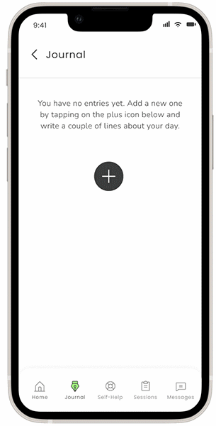
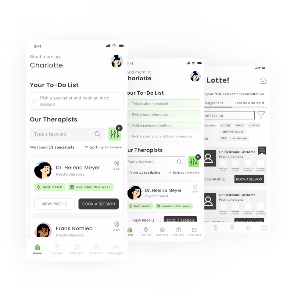
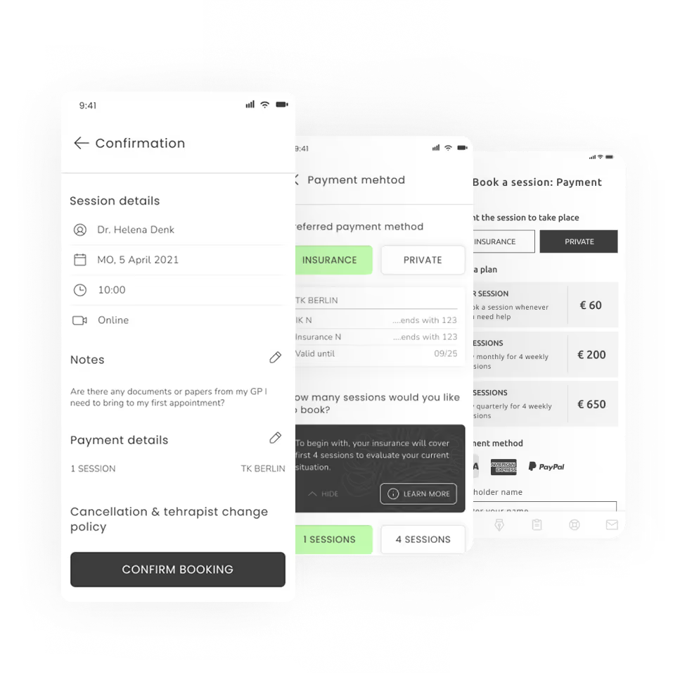
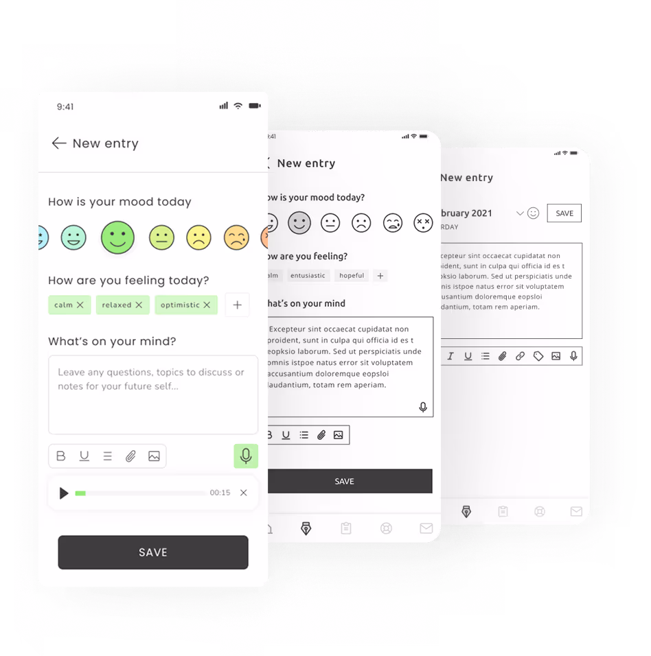
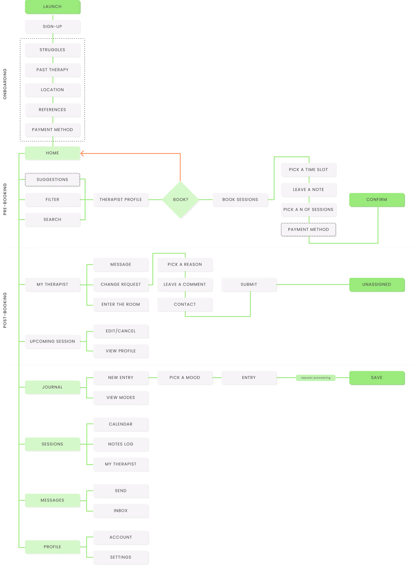
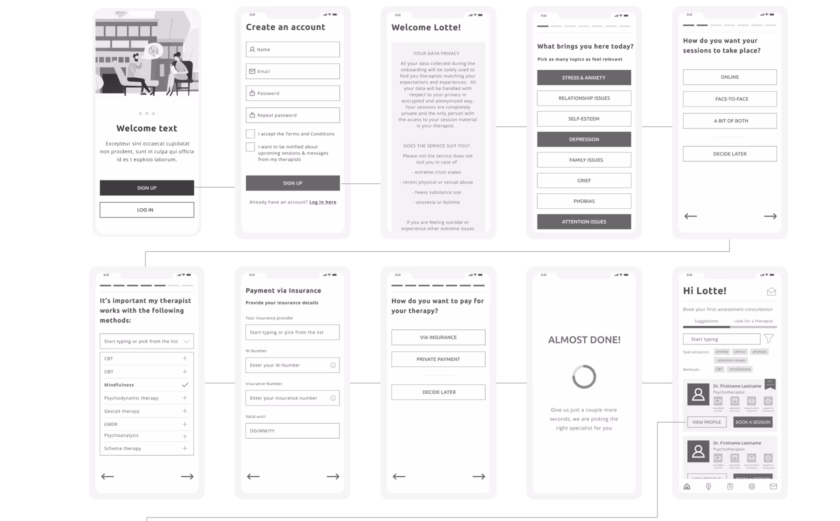
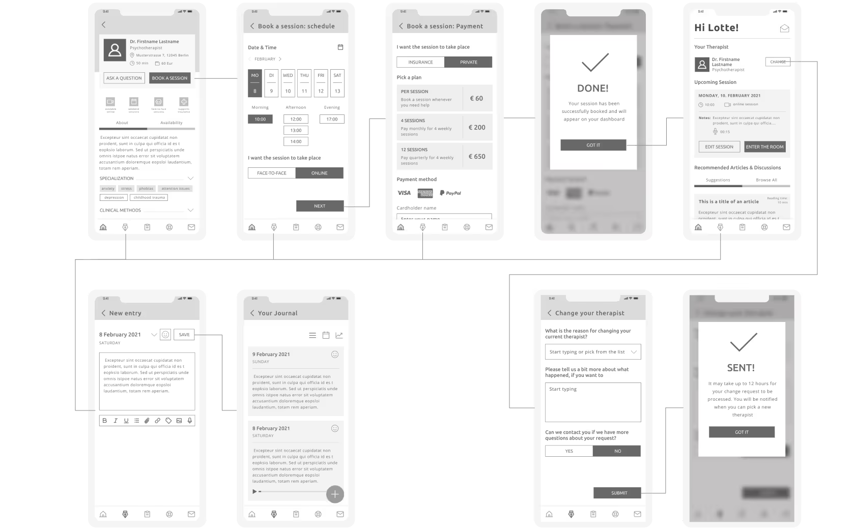
For the MVP I have focused on 4 core user flows relevant for the personas defined in the previous phase: sign-up and onboarding, therapist selection and first session booking, journal entry and therapist change request.

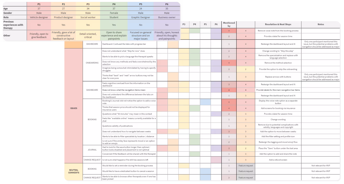
All 6 interviews have been recorded and reviewed, findings and comments have been grouped into the following categories: positive, neutral, negative and errors. These findings then have been organized in a spreadsheet to track the priority of the findings. Each issue has been given a NN Usability Score according to the severity of the issues and its impact on user experience. Issues with scores “0 ” and “1” have then been filtered out as low priority so that we can focus on problems critical for the MVP.
To identify IA and navigation issues I wanted to solve in this redesign project I have created a sitemap of the as is state of the site. This way I can clearly see where the issues are and already start working out possible solutions.
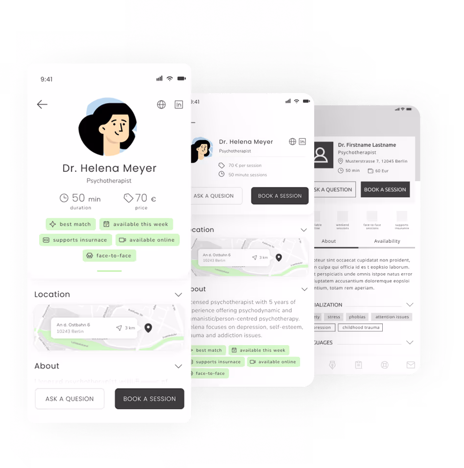
✔️ I think the specialist’s profile gives me all the information I need to take a decision
✔️ It seems to be super easy to change a therapist, I really like that
💡 I could use a bit more information about how insurance coverage works
💡 I wish I could select tags in the Journal. It’s nice to have emojis, but I want to be more specific
💡 Im not sure how valuable I'd find publications in the profile, especially if they are in a different language
⛔ I would not know what methods to pick in the onboarding, I do not really know any. Should I?
⛔ 50 minutes... Does it mean it takes me 50 minutes to commute to the office?
⛔ The dashboard is so cluttered with so many things... To be honest I feel very overloaded.
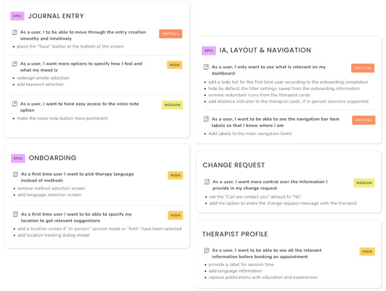
I've analysed and aggregated all the collected data to create actionable tickets based on the feedback. I've organized feedback as user stories and to-do's for each ticket and grouped them into epics to keep track of progress and keep things organized.
The severity has been assigned based not only on the number of users who brought up the issue, but also the user flow affected. Issues with navigation, information architecture, onboarding and booking are considered high or critical as the are crucial both from user and business perspective.
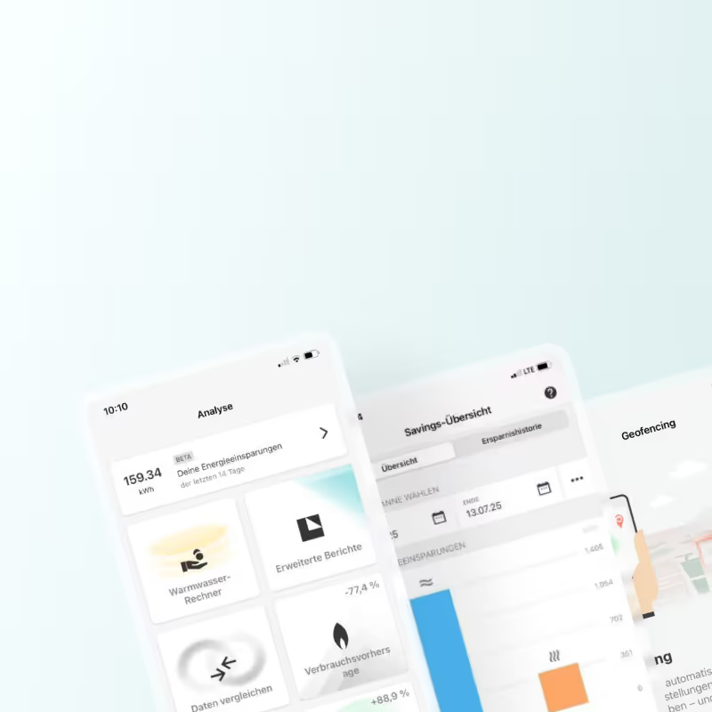
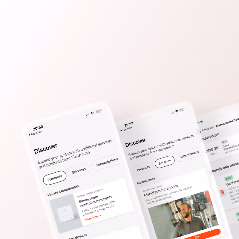
I joined the project after initial scoping and early development had been completed by another designer, who had drafted the first version of the Savings feature and scheduled user interviews. After onboarding, I stepped into the interview phase to deepen my understanding of the target audience, support analysis, and familiarize myself with the product ecosystem.
I joined the project after initial scoping and early development had been completed by another designer, who had drafted the first version of the Savings feature and scheduled user interviews. After onboarding, I stepped into the interview phase to deepen my understanding of the target audience, support analysis, and familiarize myself with the product ecosystem.
I joined the project after initial scoping and early development had been completed by another designer, who had drafted the first version of the Savings feature and scheduled user interviews. After onboarding, I stepped into the interview phase to deepen my understanding of the target audience, support analysis, and familiarize myself with the product ecosystem.