Viessmann ViCare App
ENERGY SAVINGS OVERVIEW REDESIGN
I joined the project after initial development and early research were completed. Once onboarded, I joined user interviews to better understand the audience and the product ecosystem.
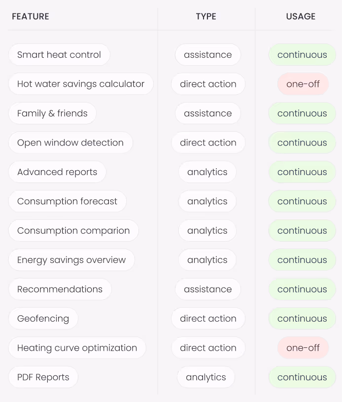
I mapped the full user flow of the Assistant feature, distinguishing free and paid functions, and categorized paid features:
📁 by type: analytics | assistance | direct action;
📁 by usage frequency: continuous | one-off,
This helped clarify feature logic, highlight user value, and reveal early opportunities to boost engagement and retention.
The first round of interviews has been carried out with 7 participants, which are current app users.
Goals of the interviews:
🎯 Validate if the users can find the entry point to the savings overview
🎯 Validate if the users understand the statistics graphs
🎯 Find out how the users feel about “negative savings” in case there is a downward trend
🎯 Find out how users feel about comparison with other households
🎯 Find out what other functionalities are desired
I joined the project after it had been initially scoped and partially developed by another designer, who had created the first draft of the savings feature and scheduled user interviews.
Show consistent timeframes across different screens
Try out different entry point cards for better findability
Remove percentage value as it's not clear what the reference is
Remove the "Great job" card as it does not have any perceived value
Move the info icon to the top right corner, consistent with the rest of the screens
Provide detailed analytics on savings history and comparison value
Remove or redesign comparison block without it feeling like an ad
Remove percentage values or replace them with Euro, if possible
Make recommendations relevant for the specific user setup
Low severity / cosmetic / easy fix
Medium severity / needs discussion
Critical issue
After updating the prototypes based on user feedback, we ran a remote qualitative test using Maze to validate the changes and gather preferences. With support from the research team, I designed and set up a usability test for beta users.
Test goals included:
🎯 Checking if users expected to access “Savings” via the dashboard card or “Analytics” menu
🎯 Testing if the info overlay about default settings was easy to find and understand
🎯 Running a preference test for the savings history view (timeline vs. two-timeframe comparison)
🎯 Evaluating findability and perceived value of recommendations
🎯 Assessing the perceived value of the hardware promo card
🎯 Evaluating the perceived value of savings tips on device configuration screens
After presenting the test results in the round, we carried out a workshop with the Product owner, data scientist, developer & UI designer to ensure the implementation of the feedback is feasible and is within our timeline and budget.
1. Entry point
Although there have been several misclicks, the trend showed that most users tapped on the top card and “Analytics” menu item.
Todos:
Entry point via dashboard tile at the top
Secondary entry point via “Analytics” menu item
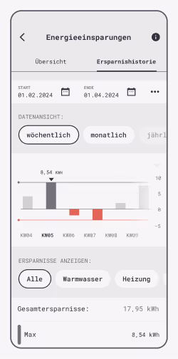
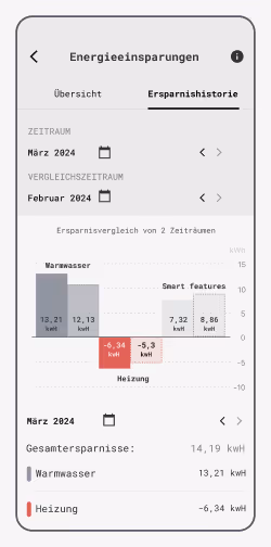
2. Savings history view preference
60% of users preferred the timeline view, though the sample size limits representativeness. Based on preference and ease of implementation, variant B was selected.
Todos:
Pick timeline view for implementation with monthly & yearly granulation
Check technical feasibility for the time series data
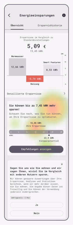
3. Recommendations findability
Sentiment varied by user type, with current subscribers being most negative, saying they already know what to do and found the recommendations unhelpful.
Todos:
Show recommendations if there is potential for setup optimization
4. Perceived value of the hardware promotion block
Mixed sentiment across all user groups. The least impressed group was past subscribers.
Todos:
Only show this block to users with compatible systems
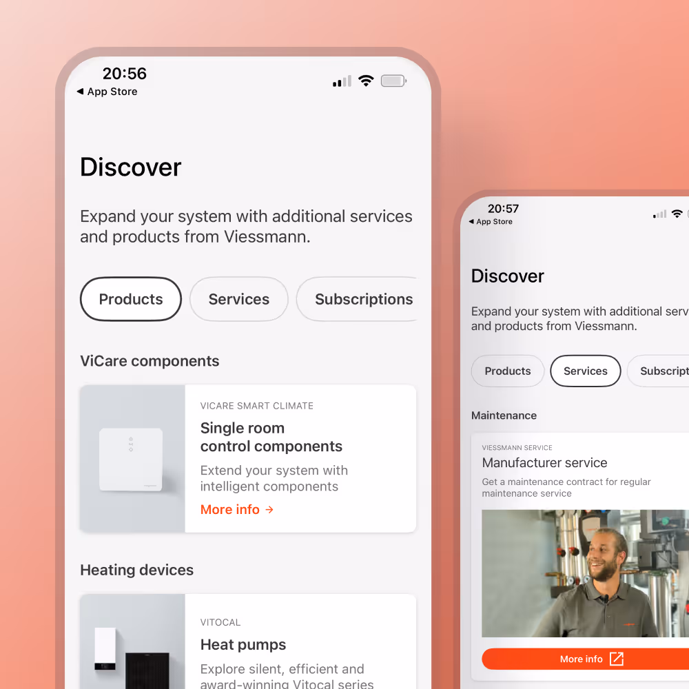
Move this block to “Discover” tab that is designed for cross-selling
5. Acting on a recommendation
17/20 respondents found the correct path with the first click
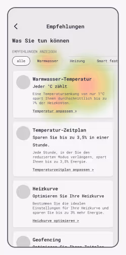
6. Perceived value of recommendations
Predominantly positive feedback with only 3 people feeling annoyed by "common sense information".
Todos:
Allow deactivating / closing the hints for all settings.
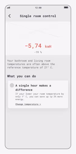
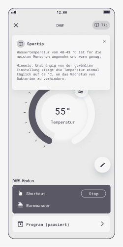
For hot water settings, set the lowest temperature to 60 degrees
After we confirmed the improvements and their priority, I went ahead and updated the prototypes accordingly.
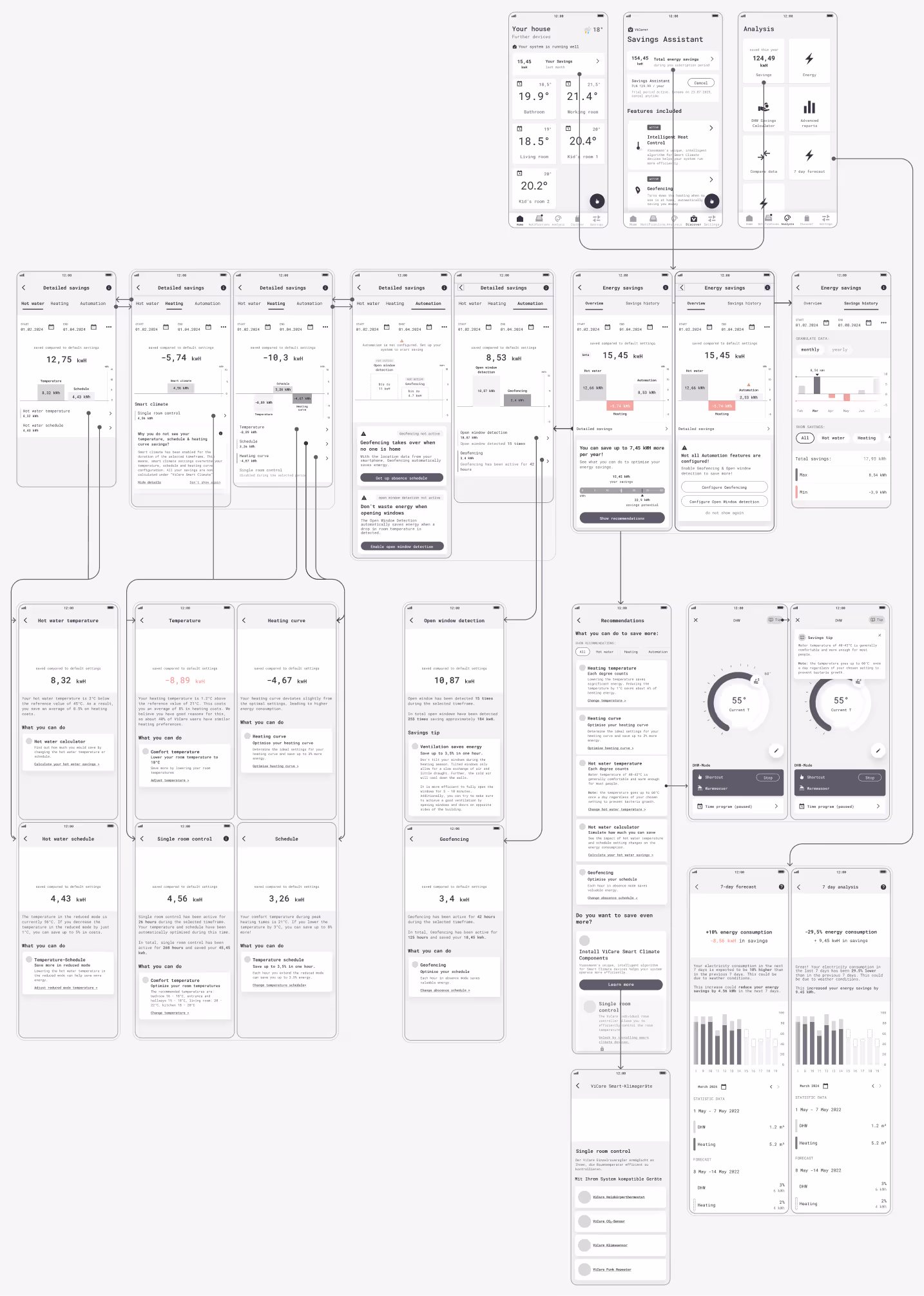
Multiple entry points
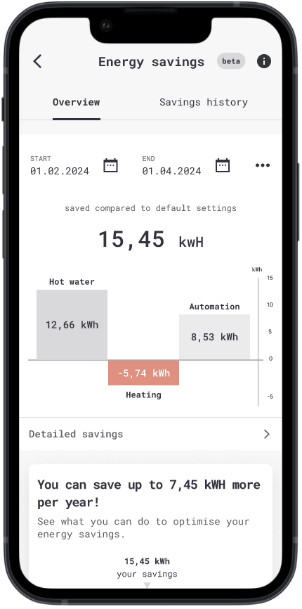
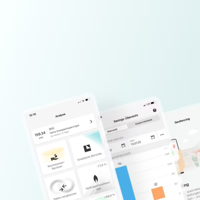
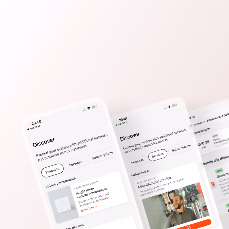
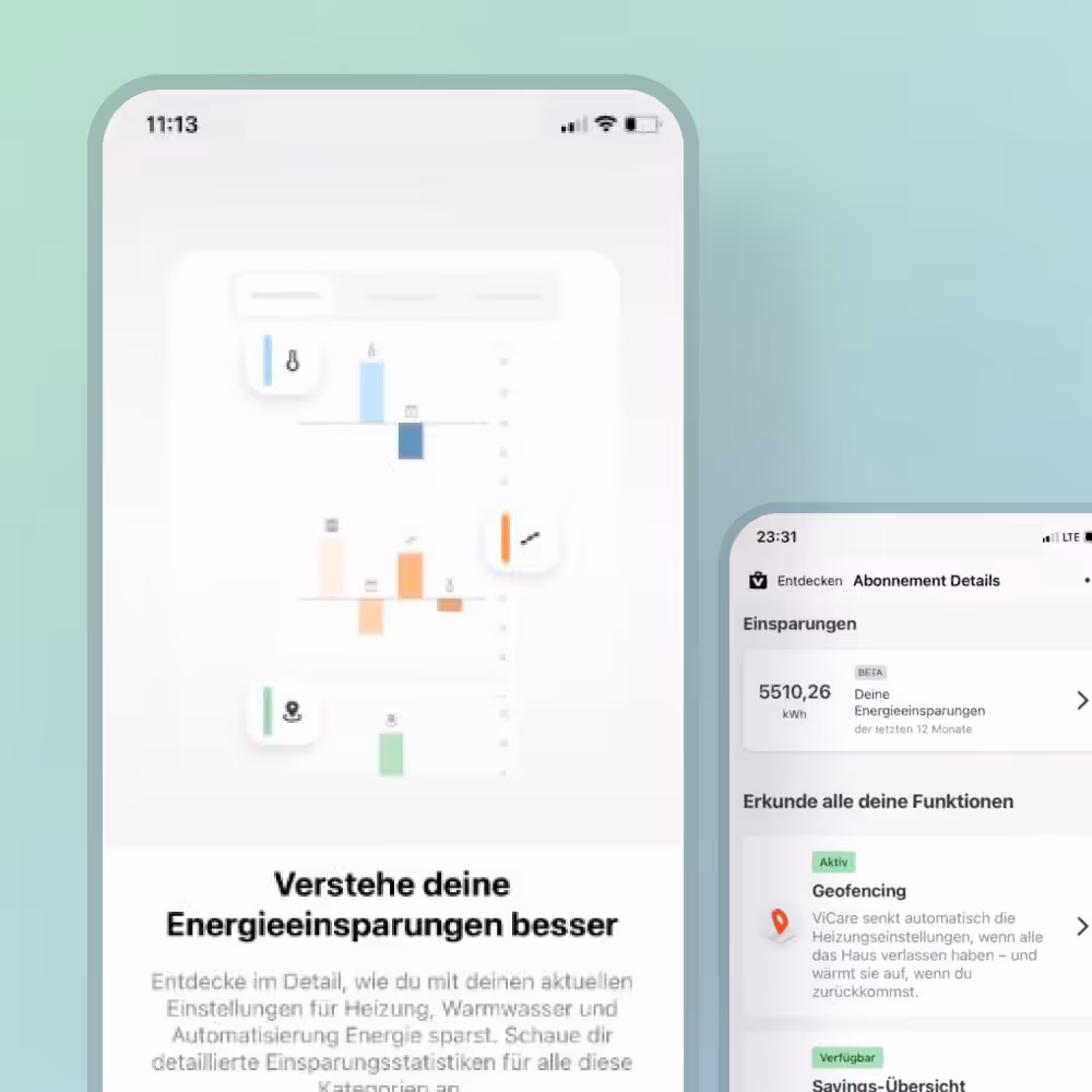
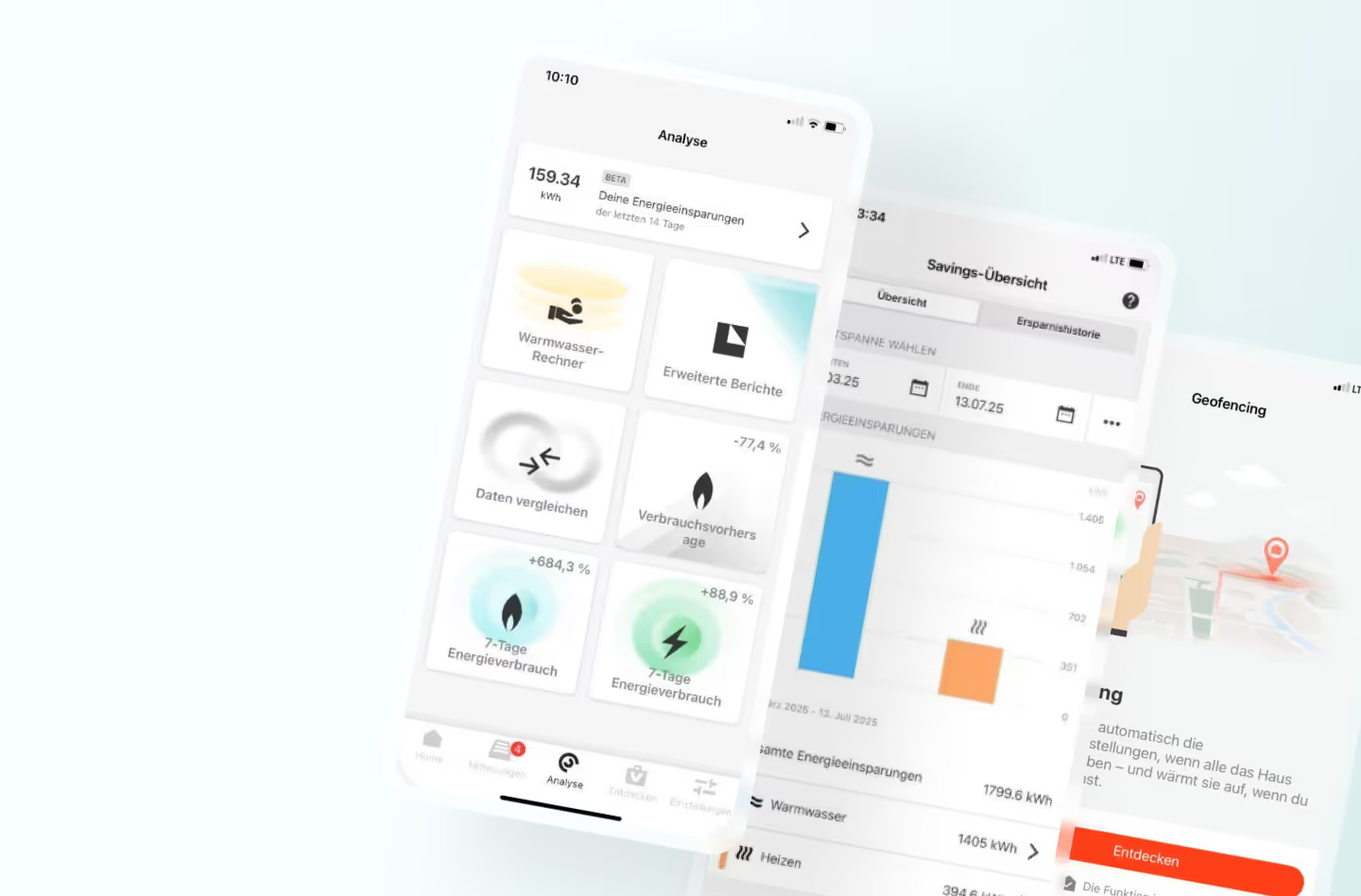
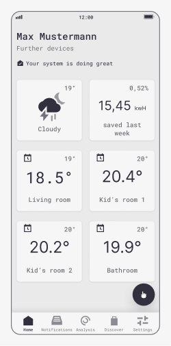
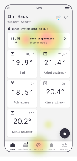
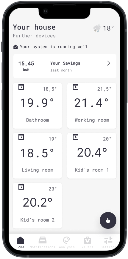
The savings overview is available via the home screen card showing weekly savings, the Analysis card showing all savings this year and subscription page showing all savings during subscription period.
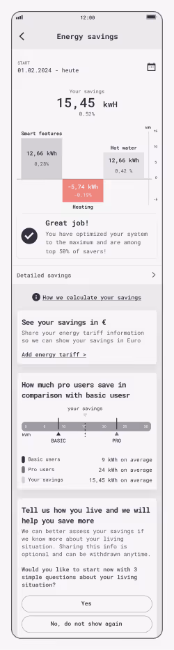
Current overview & timeline data
Navigation with simple list dropdown menus. Services menu item does not have a drop-drown functionalities listing services or service categories.
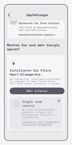
Saving tipps
Based on the users hardware combination and settings the Savings assistant offers optimization recommendations.

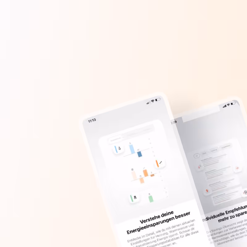
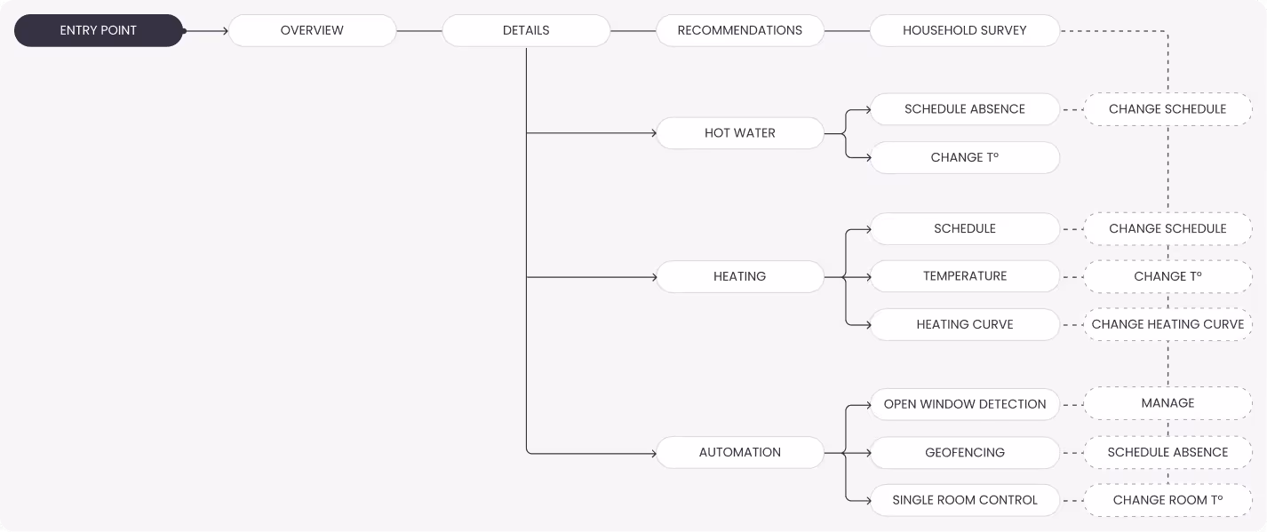
Savings details & recommendations by category
View savings breakdown by source: heating, hot water and automation. The prototype shows the "happy path" will all features and smart devices available. We have also covered scenarios for users without smart thermostats and/or open window detection.