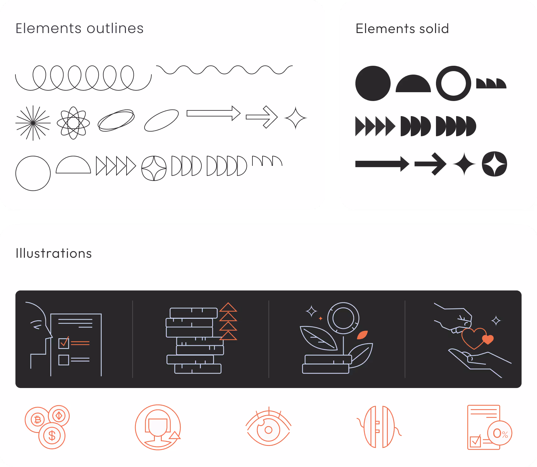
I have sketched down two versions of the layout of various sections and picked two options to pick from in terms of look and feel: rounded hand-drawn shapes versus geometric ones inspired by neo brutalism style, that is more in line with the direction picked by the previous deisgner.
In a team review we decided to proceed with the geometric concept and confirmed the section priority.
I joined the project after initial scoping and early development had been completed by another designer, who had drafted the first version of the Savings feature and scheduled user interviews. After onboarding, I stepped into the interview phase to deepen my understanding of the target audience, support analysis, and familiarize myself with the product ecosystem.
I joined the project after initial scoping and early development had been completed by another designer, who had drafted the first version of the Savings feature and scheduled user interviews. After onboarding, I stepped into the interview phase to deepen my understanding of the target audience, support analysis, and familiarize myself with the product ecosystem.
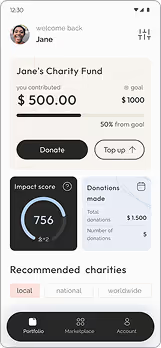
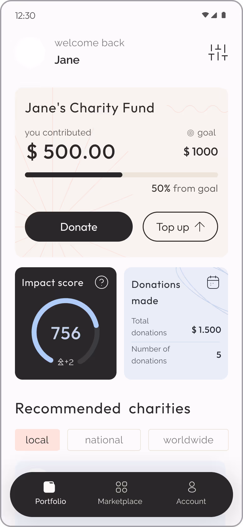
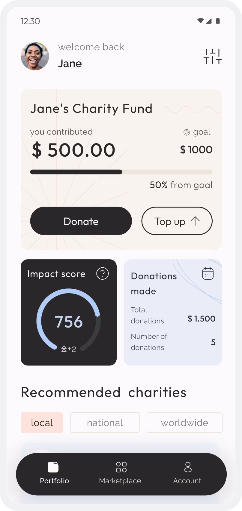
As a user I want to be able to see my fund status and how close I am to achieving my goal
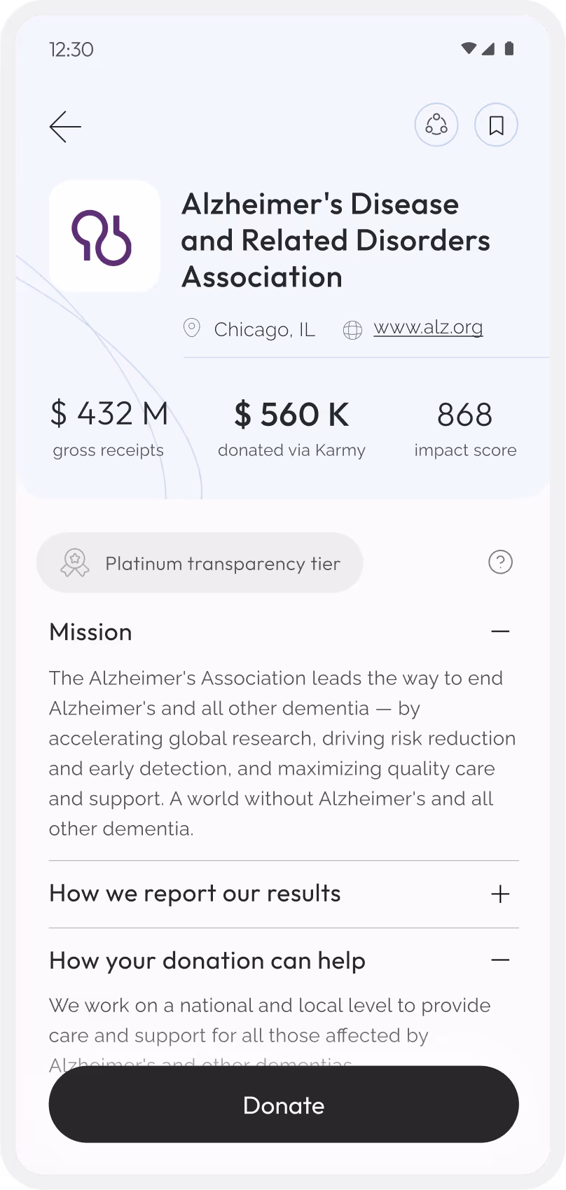
As a user I want to be able to see my impact score
As a user I want to be able to see my total donations
As a user I want to be able to see recommended charities
As a user I want to be able to filter charities by location range
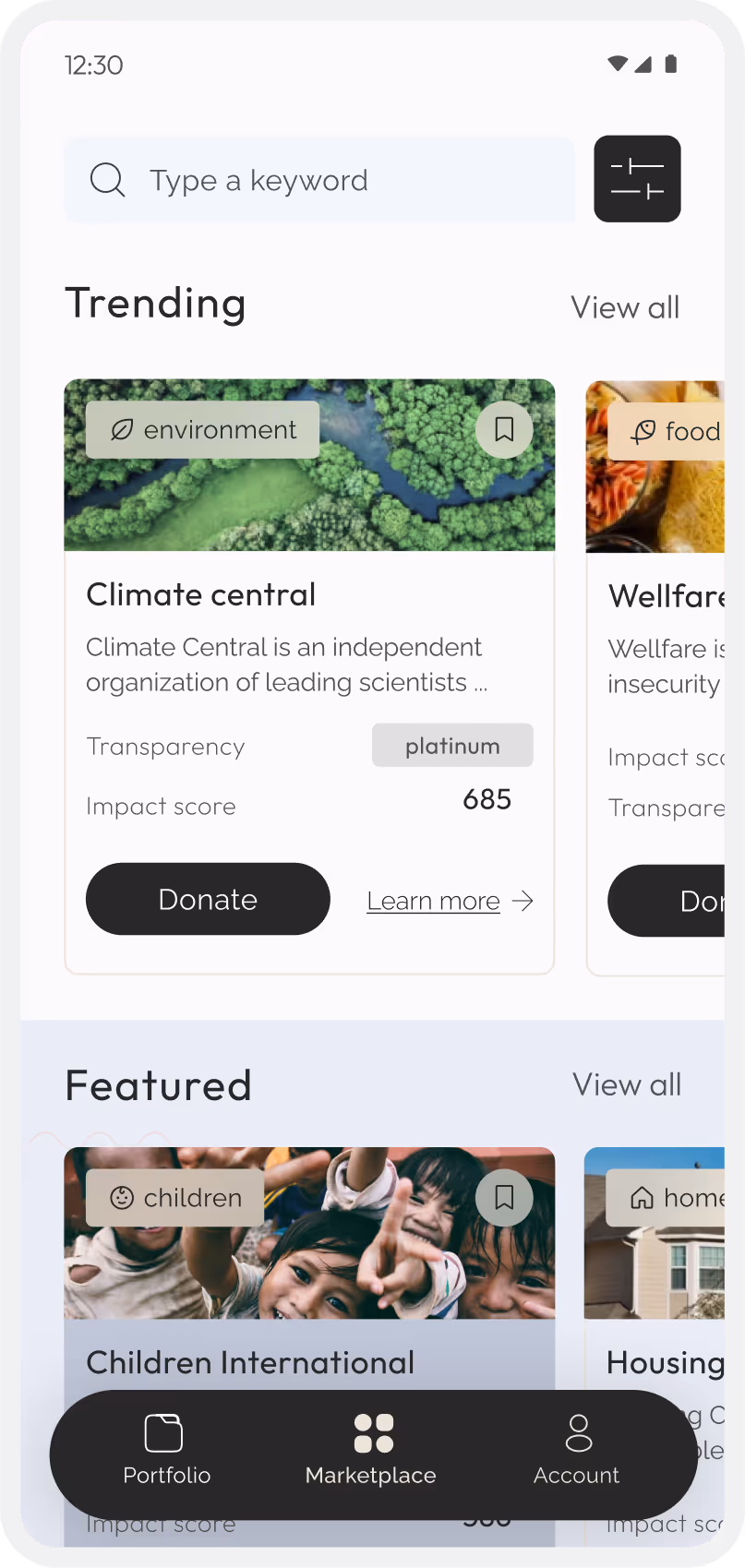
As a user I want to be able to see trending, featured and recommended charities
As a user I want to be able to see the charity’s name, description, impact score
As a user I want to be able to donate to the charity of choice from this screen
As a user I want to be able to see my name, short bio and interests
As a user I want to be able to see my donation stats
As a user I want to be able to see my badges
As a user I want to be able to see my donation historyAs a user I want to be able to edit my profile
As a user I want to be able to see trending, featured and recommended charities
As a user I want to be able to see the charity’s name, description, impact score
As a user I want to be able to donate to the charity of choice from this screen
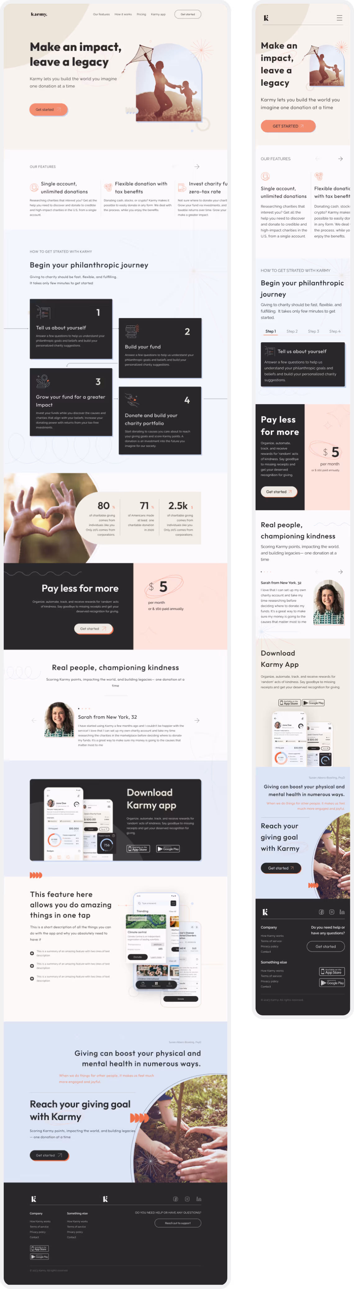
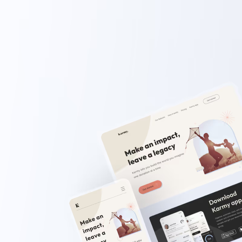
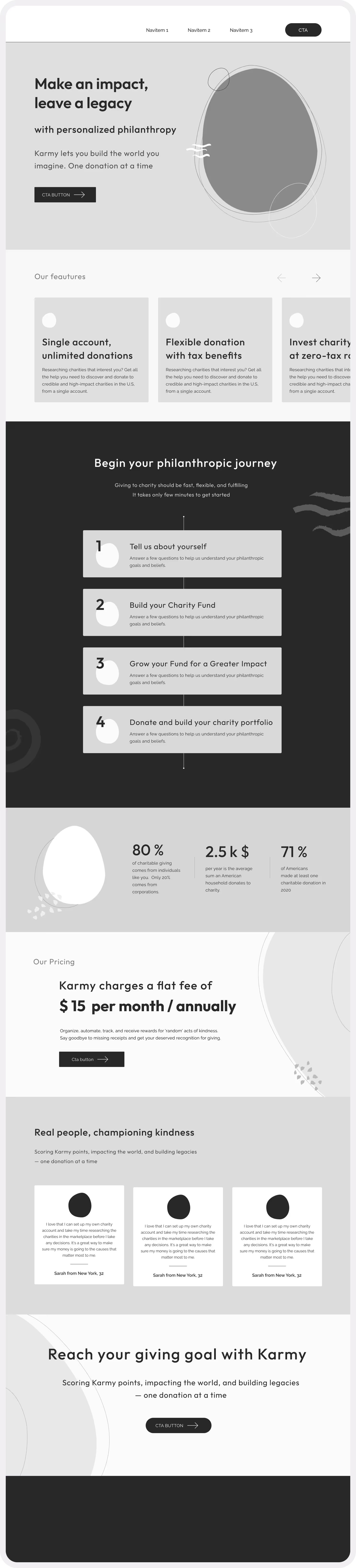
The Karmy team wanted to showcase the app to communicate the core features in a more visual and transparent way. We have scoped out 4 core features/screens: homescreen, profile, market place and charity detail page. The team has also prepared use cases and thoughts on how these features should work, which I translated into user stories before sketching down the designs.
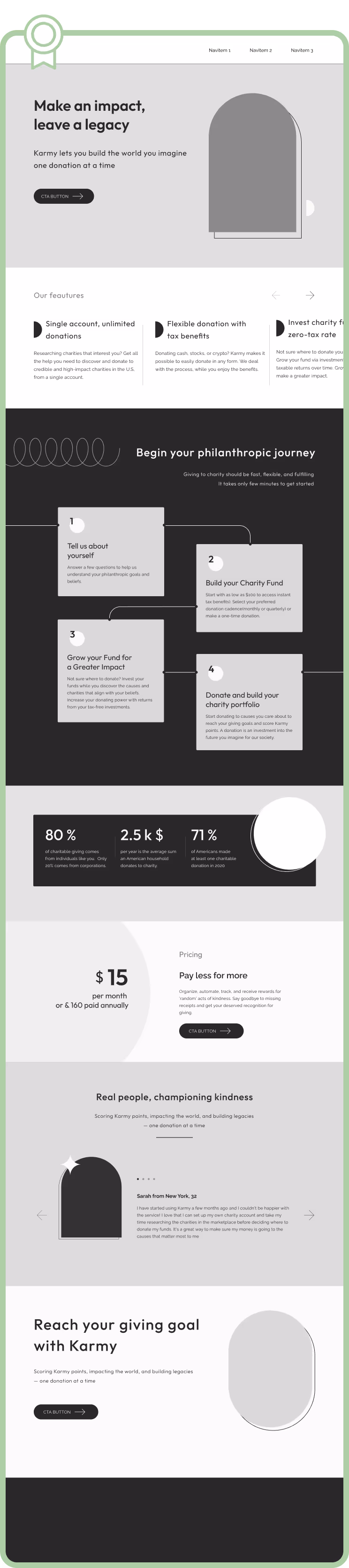
After we reviewed all the section layout variations, color block order and imagery we have confirmed the final layout for the desktop version, which has then been modified into a mobile-friendly version.